Unveil and style
Sensuality, self-redefinition, depth of style, and transformation.
Portfolio / Shifting by Cloto
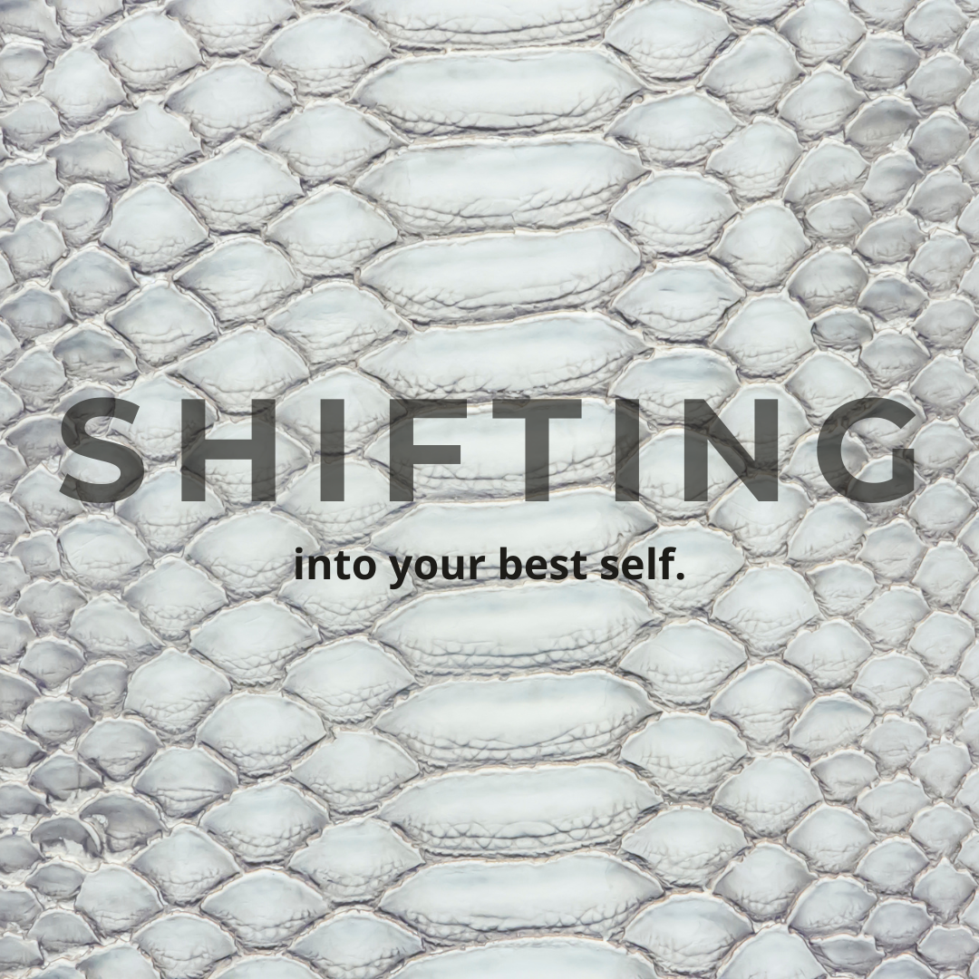
I worked on the project’s launch phase, building its initial communication system.
The project lead supplied the photographs. From there, I independently developed communication themes, research, concepts, names, copy, and graphics. I then prepared the schedule and feed simulation, incorporated any changes, and published the content.
The overarching “When Opera Meets Rock” concept came from the project lead. The names of individual garments, the pairings between opera and rock, and the other editorial directions grew from my research and were submitted for her approval.
The brand later changed its name to Rebelodia. This page uses Shifting by Cloto, the name in use during my assignment.
Proposals were presented before the final content. I did not receive a pre-built thematic direction: I began with the photographs and independently proposed the narrative territory.
The pages shown here are the original presentations delivered to the project lead. Open them to see the transition from the idea to its planned channel adaptations.
Sensuality, self-redefinition, depth of style, and transformation.
Natural and vegan leather; transformation as a natural process and as pressure that refines.
Quotation research, proposed pairings, and guidance for the visual language.
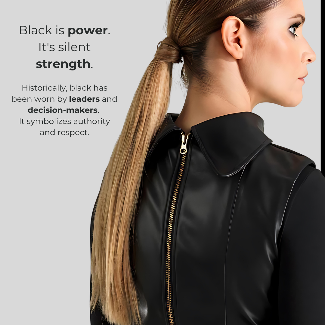
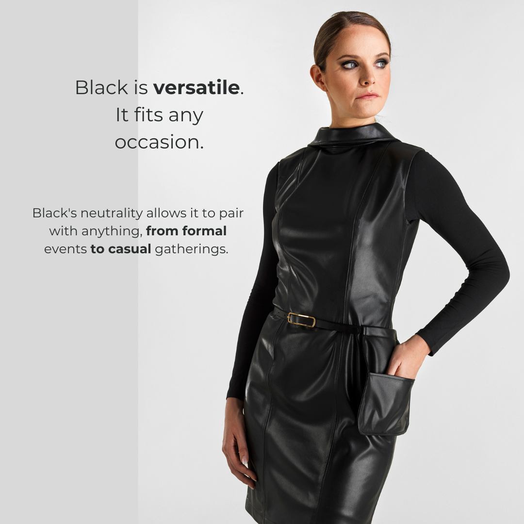
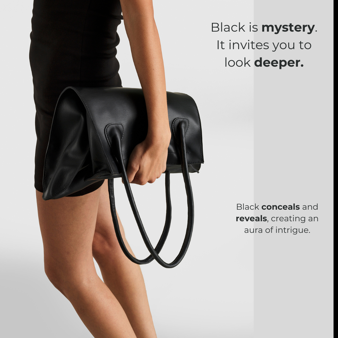
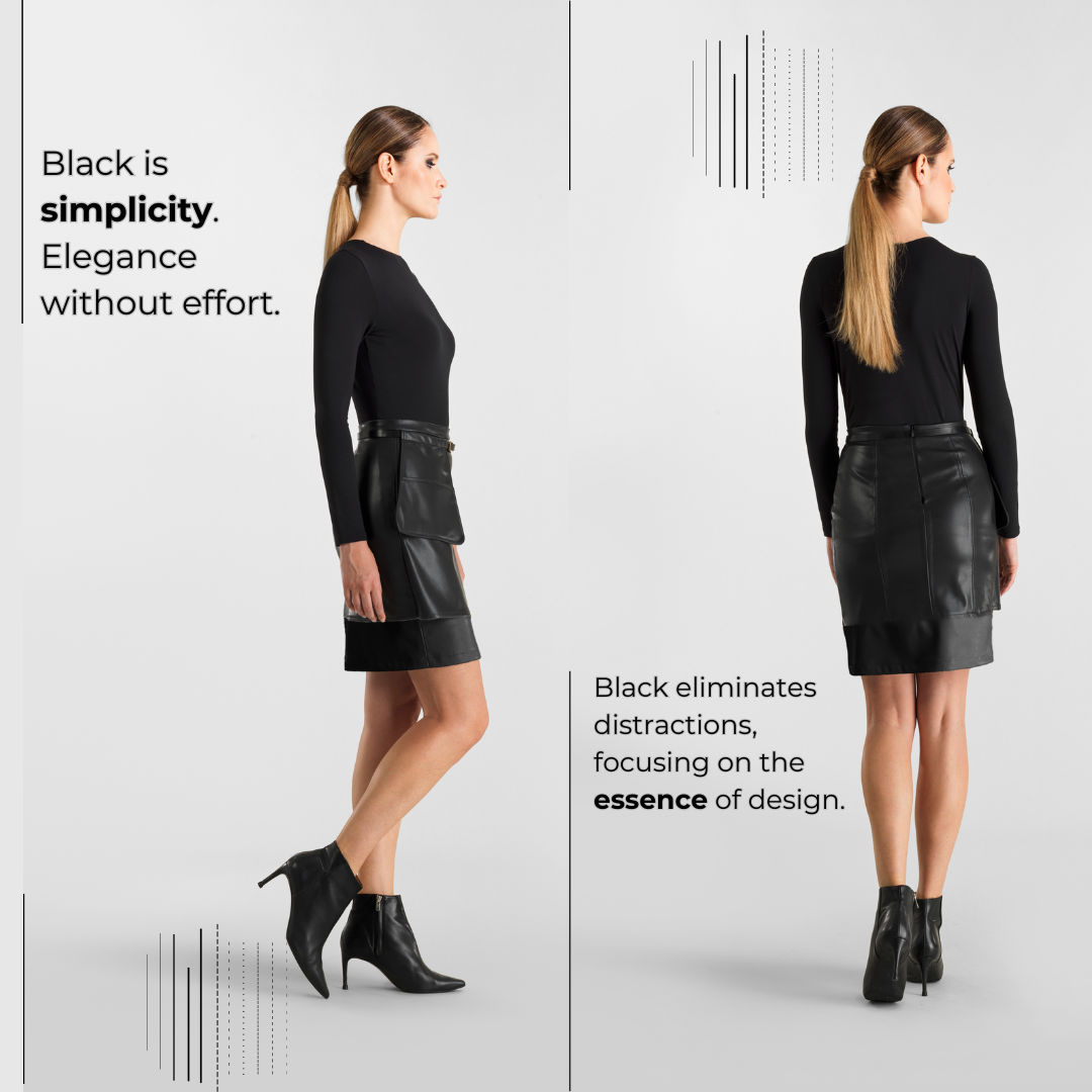
Five editorial directions exploring universality, power, versatility, mystery, and simplicity.
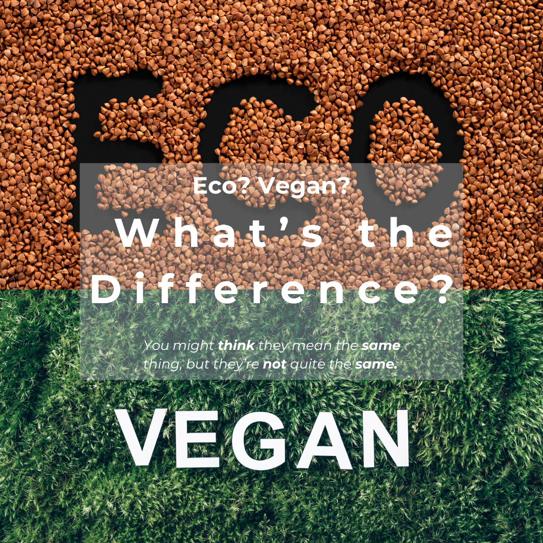
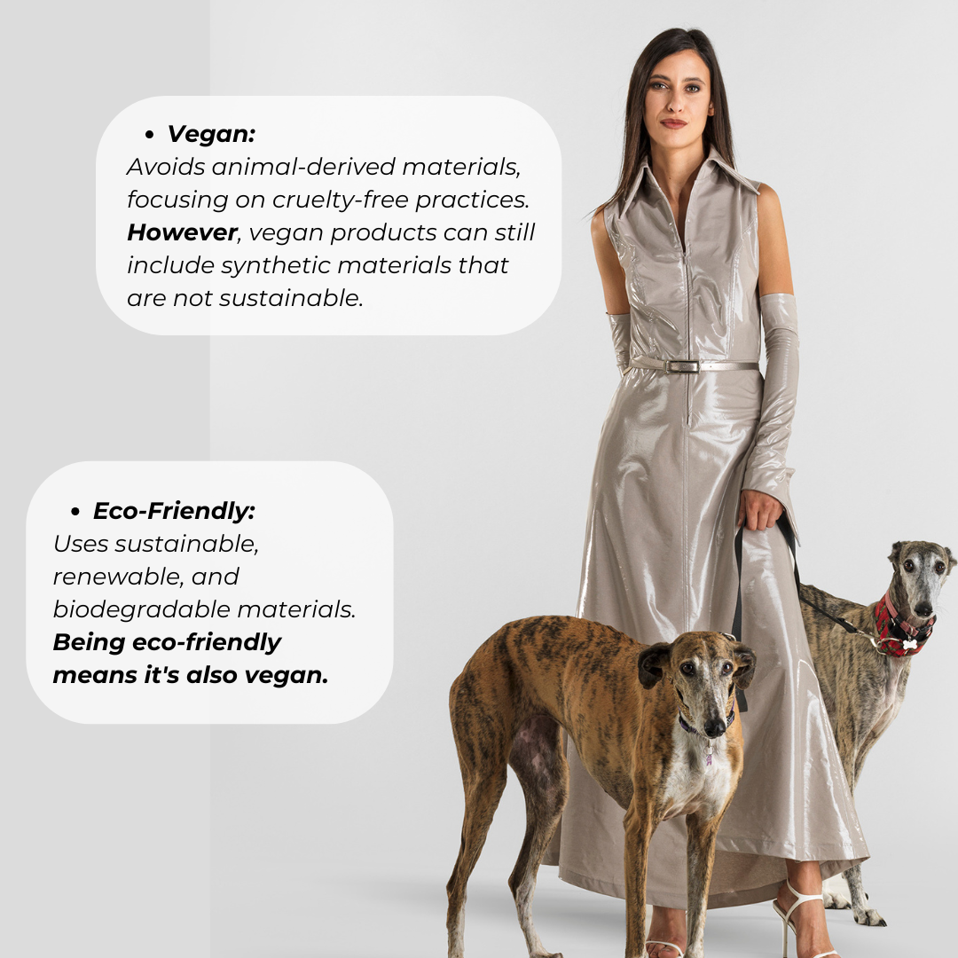
An explanatory piece distinguishing two criteria often treated as equivalent.
The story of the garment and a series devoted to the dimensions of beauty according to Shifting.
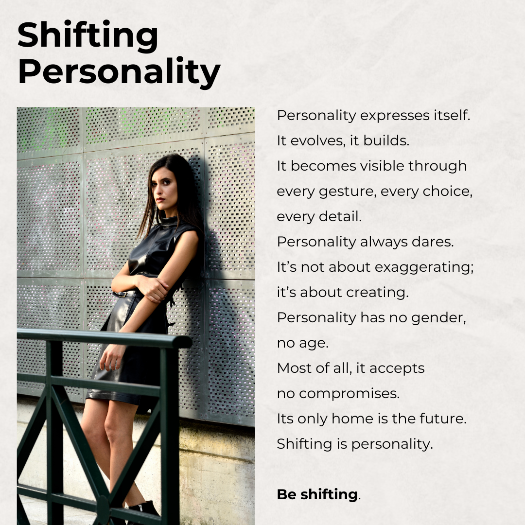
Personality expresses itself, evolves, builds.
It makes itself visible through every gesture, choice, and detail.
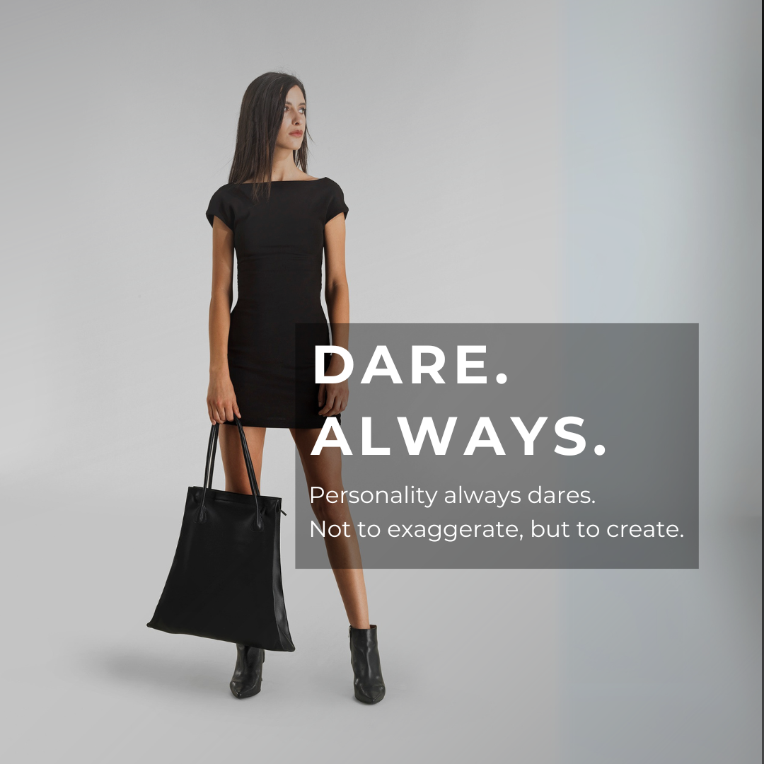
Personality always dares.
It is not about excess, but construction.
Personality has no gender and no age.
Above all, it accepts no compromise.
Only the future belongs to it.
SHIFTING IS PERSONALITY.
BE SHIFTING.
The manifesto is entirely my work. I chose to address neither men nor women, but personality: something within us that we wear on the outside.
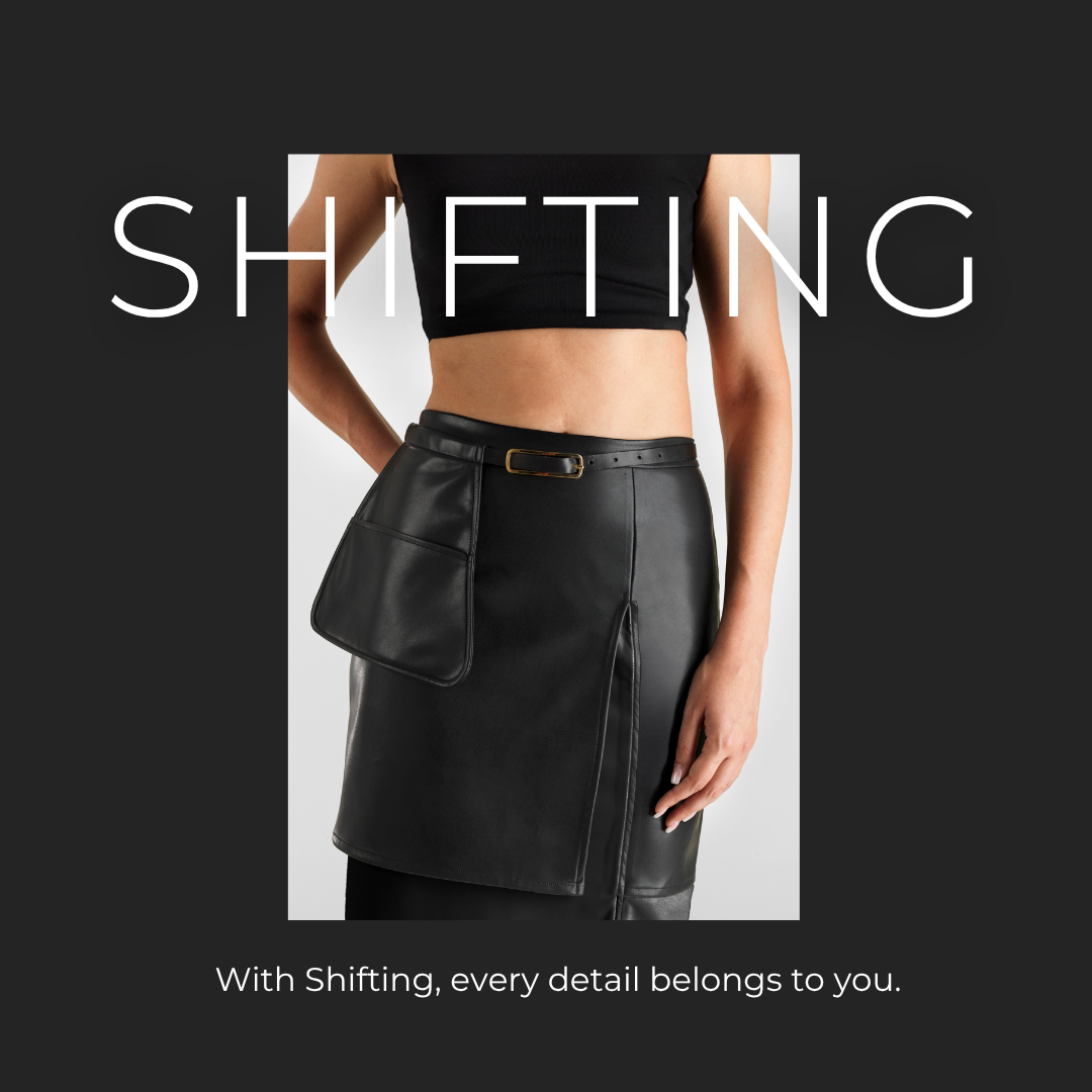
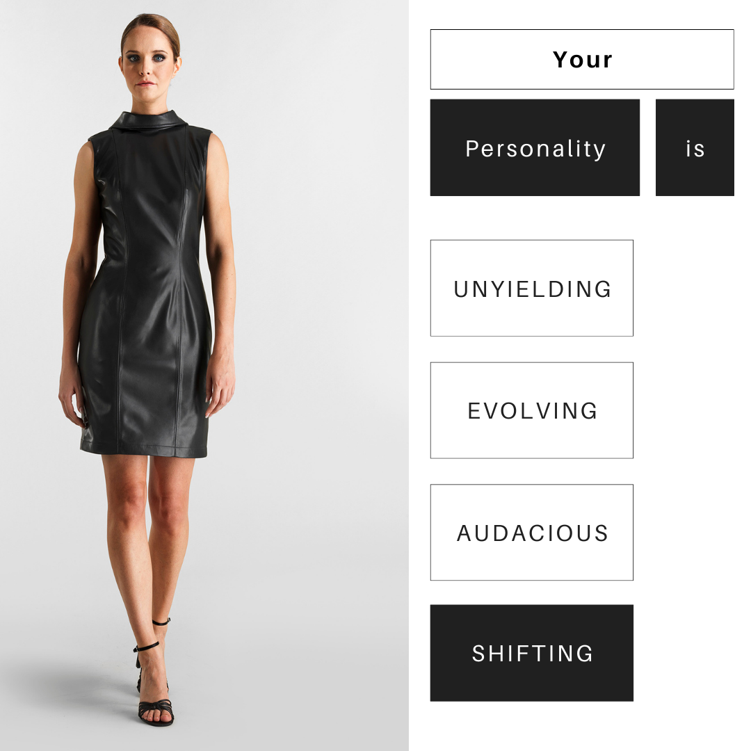
The point was sensuality: showing the body without reducing the gesture to mere exposure. The garment reveals forms and parts of the body, but the wearer chooses how to define them and how to present themselves.
“Unveiling isn’t about showing, it’s about becoming. Redefining your style, your way.”
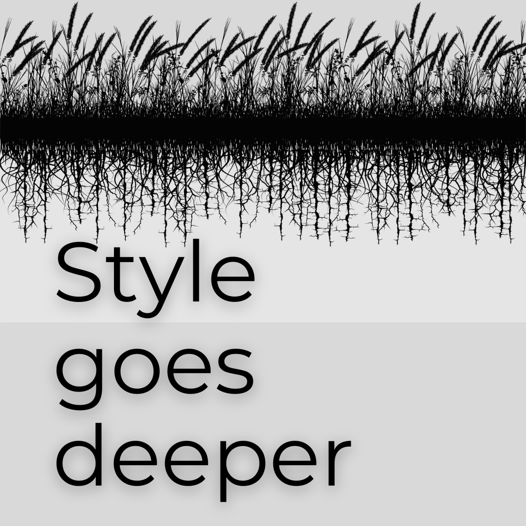
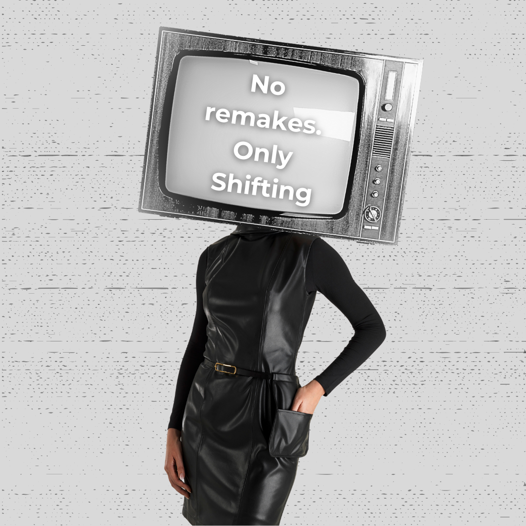
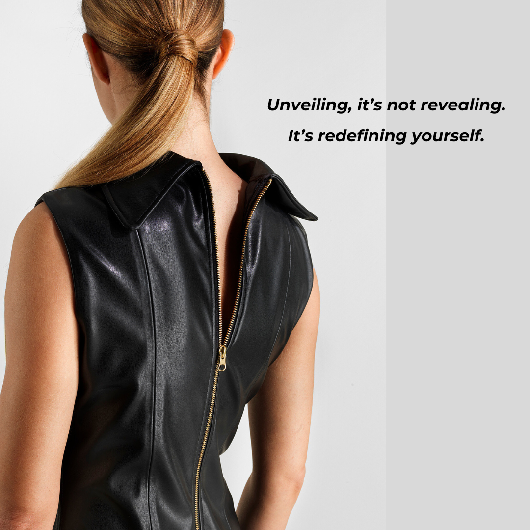
The proposal developed two strands: natural and vegan leather, explored through sustainable materials and craftsmanship; and the diamond as a parallel for pressure, gradual transformation, refinement, and emergence.
“I focused on two main strands: natural and vegan leather, and the concept of shifting as a natural process.”
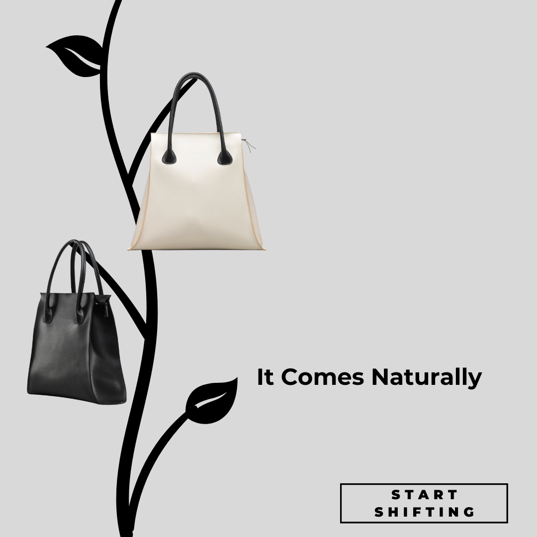
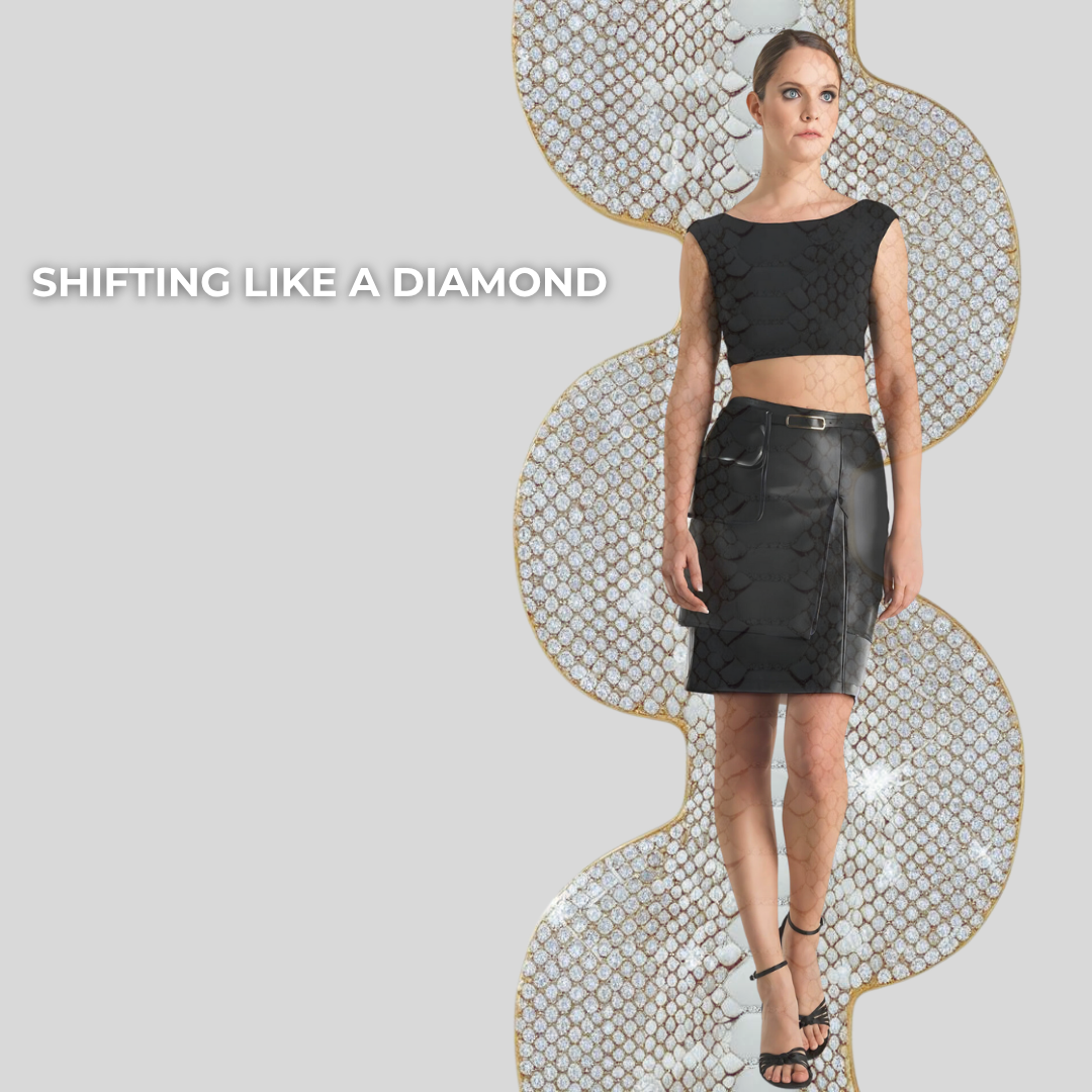
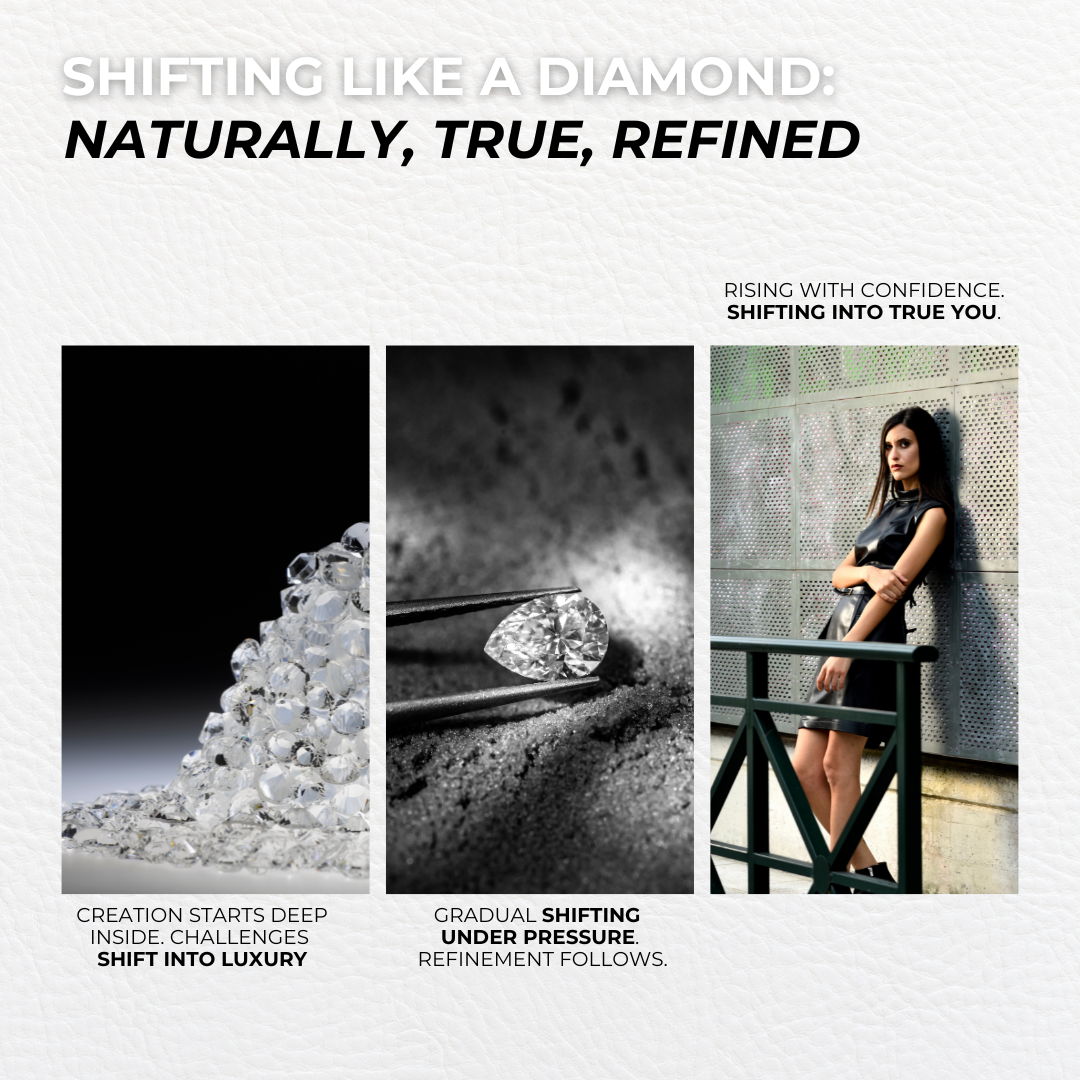
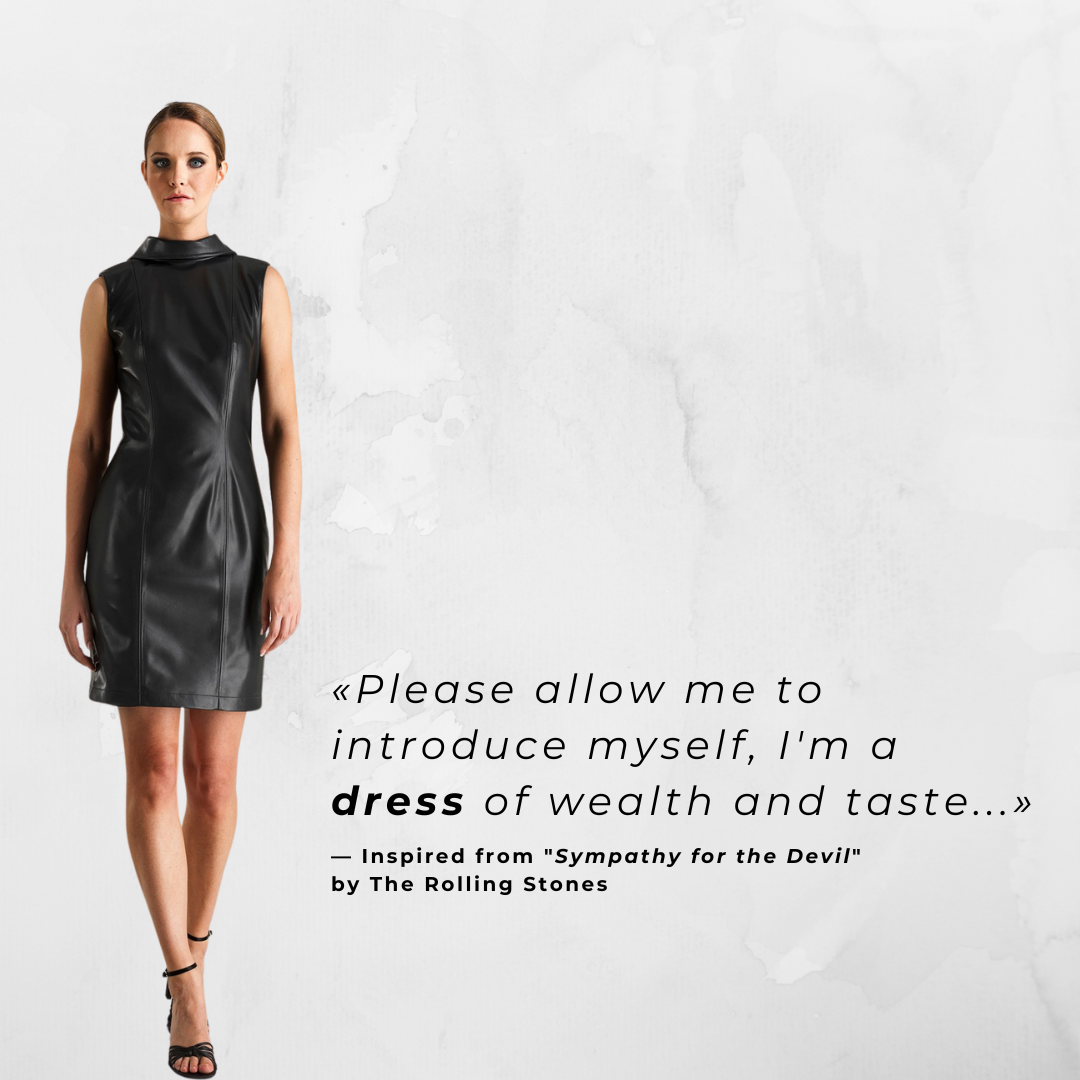
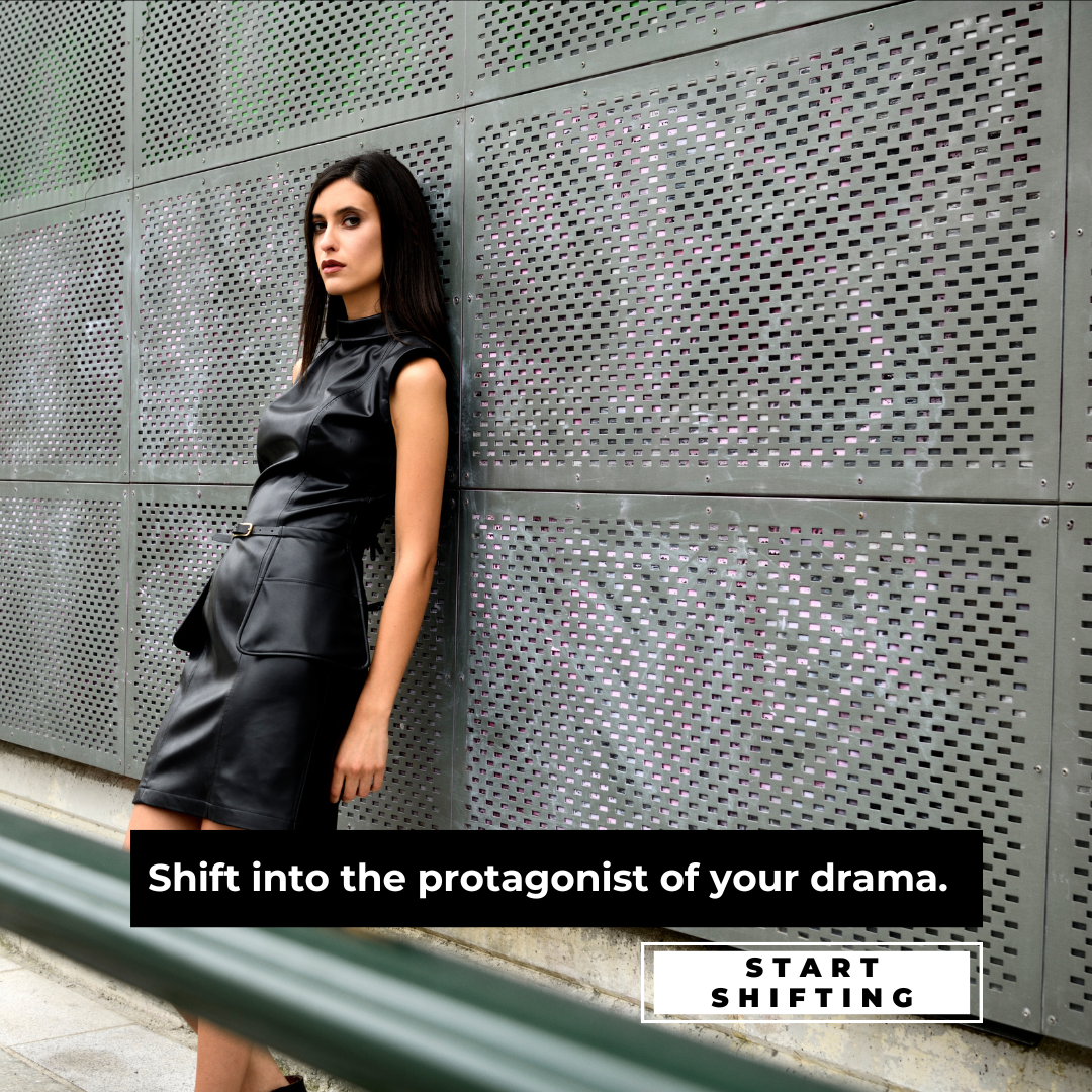
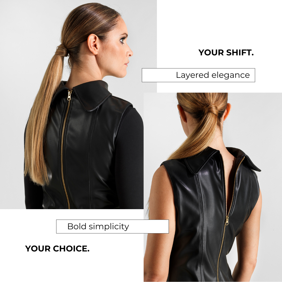
The name grew from research into Aida, a character divided between identity, imposed role, and belonging. The garment translates that duality into a transformable form, yet gives its wearer a freedom the character does not possess: the choice of how to appear.
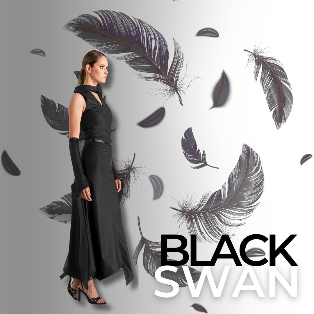
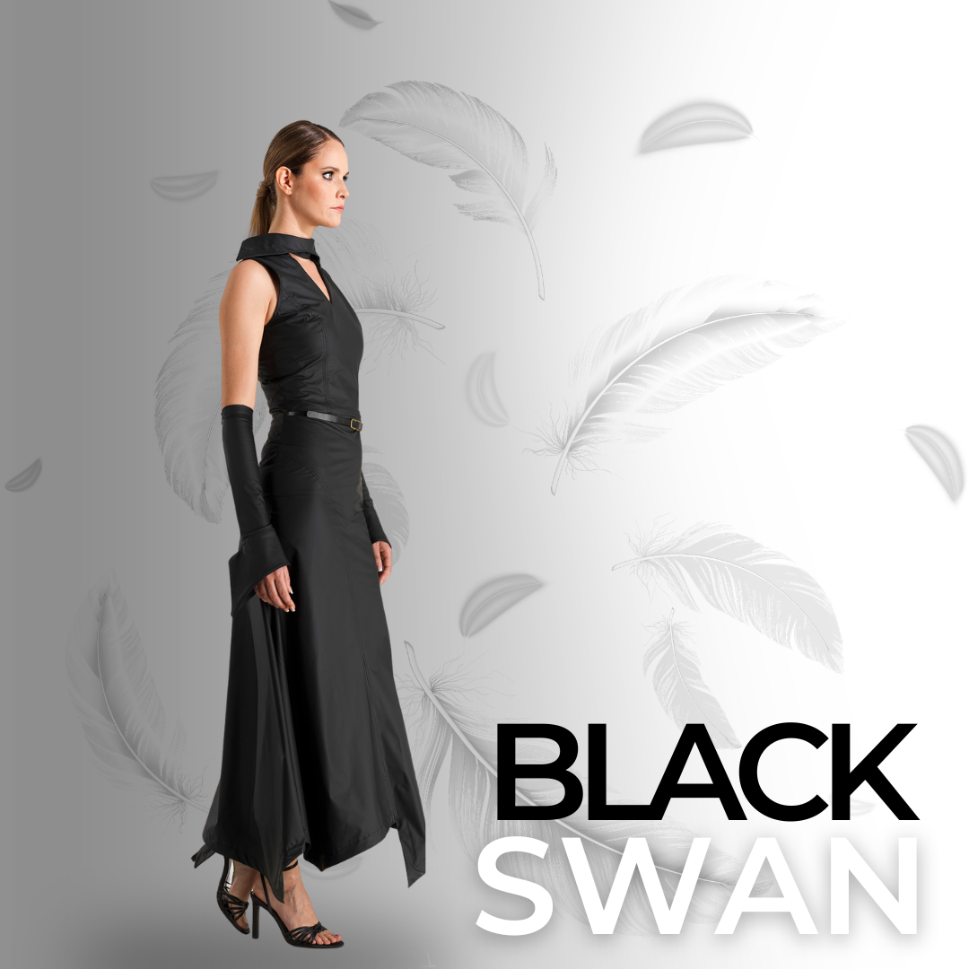
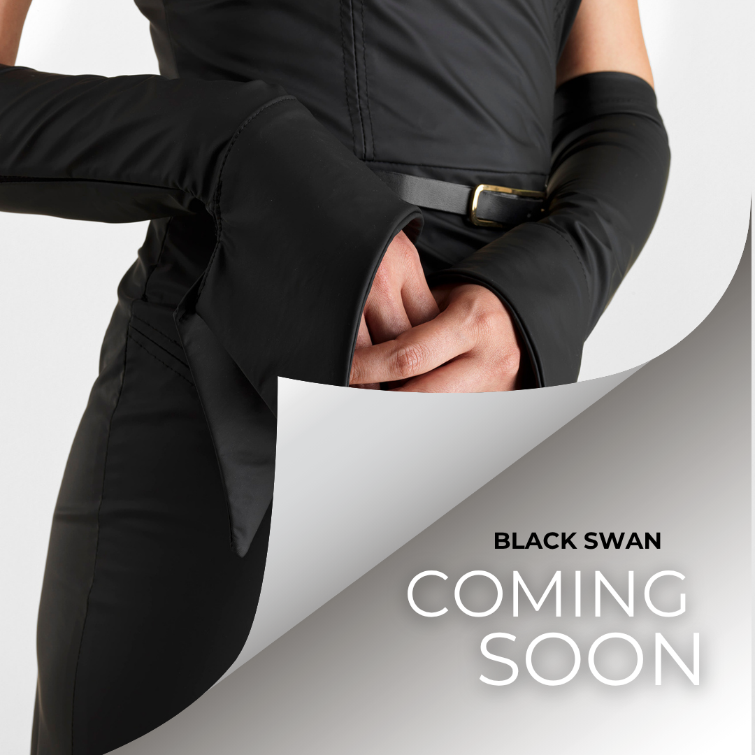
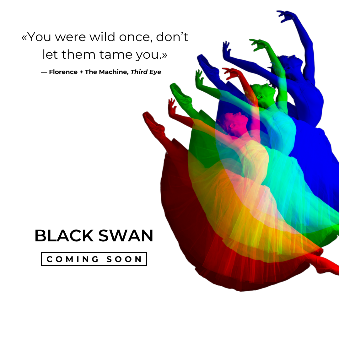
The name grew from the garment’s transformability. With sleeves, it gained a more elegant, theatrical presence; without them, it became more classic and essential. The piece could alter its character without losing its identity.
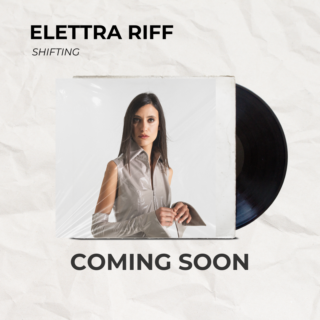
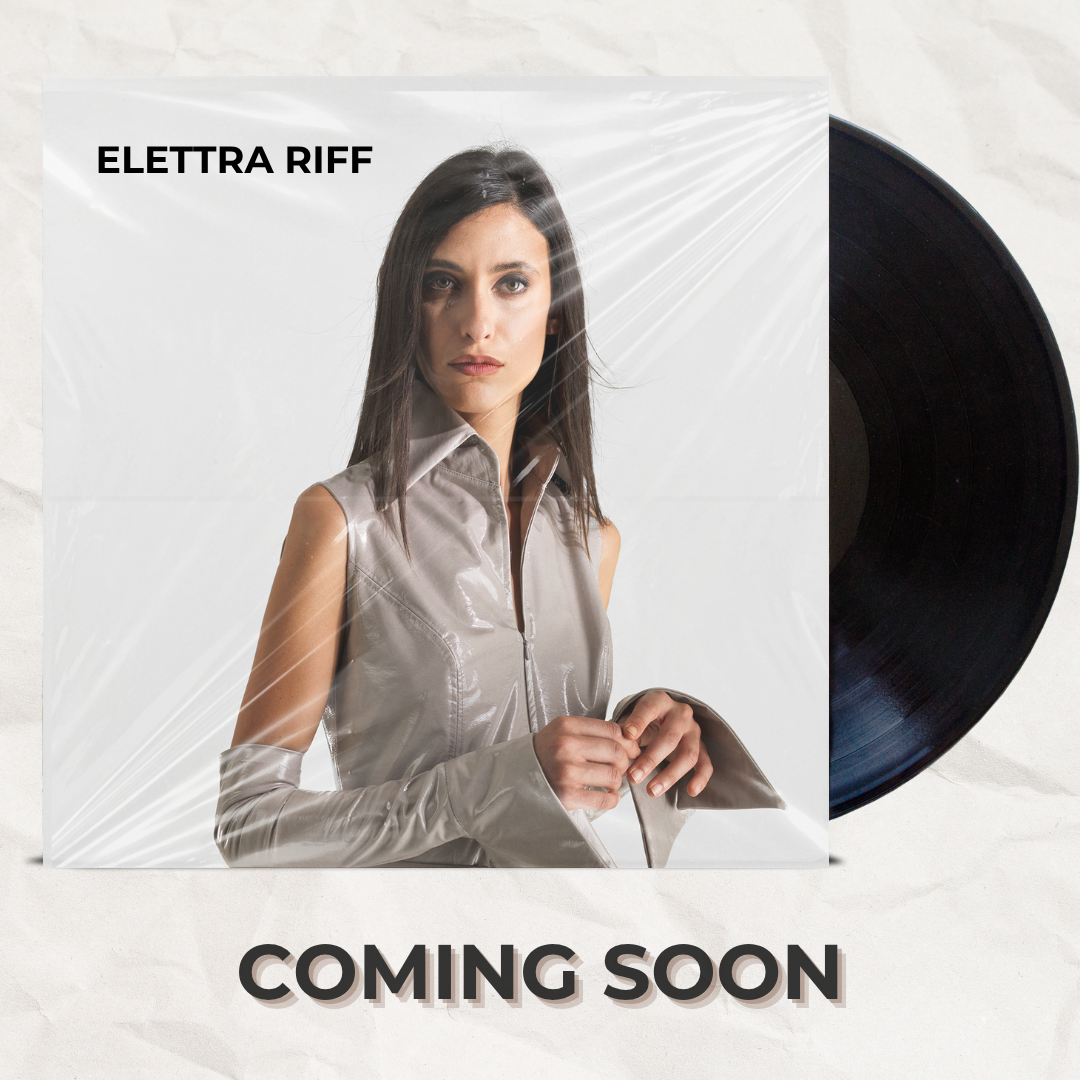
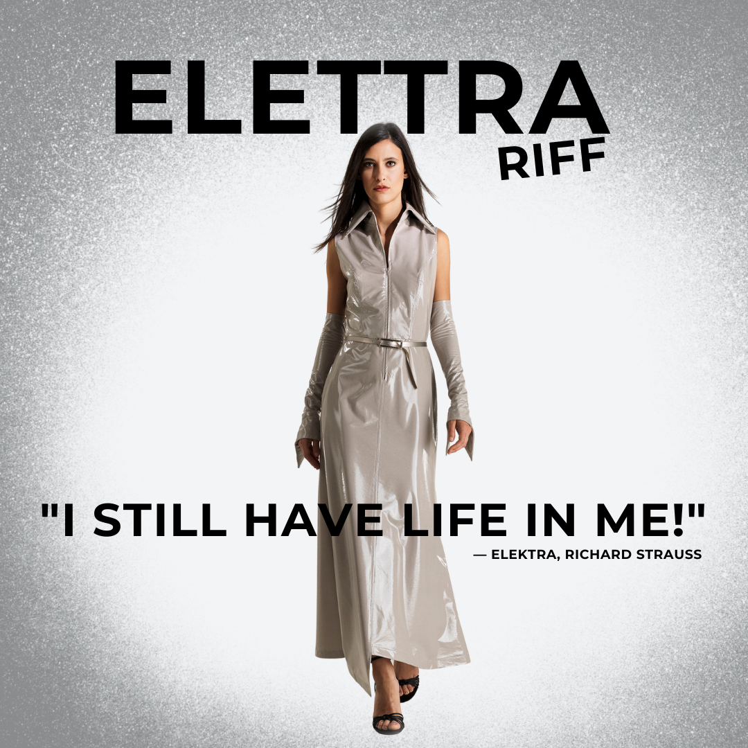
The name came from a dress worn with a powerful presence. Elettra evoked the character’s obsessive tension, not anger: something insistent that never dissolves. “Riff” translated the same continuity into sound, like a returning guitar phrase.
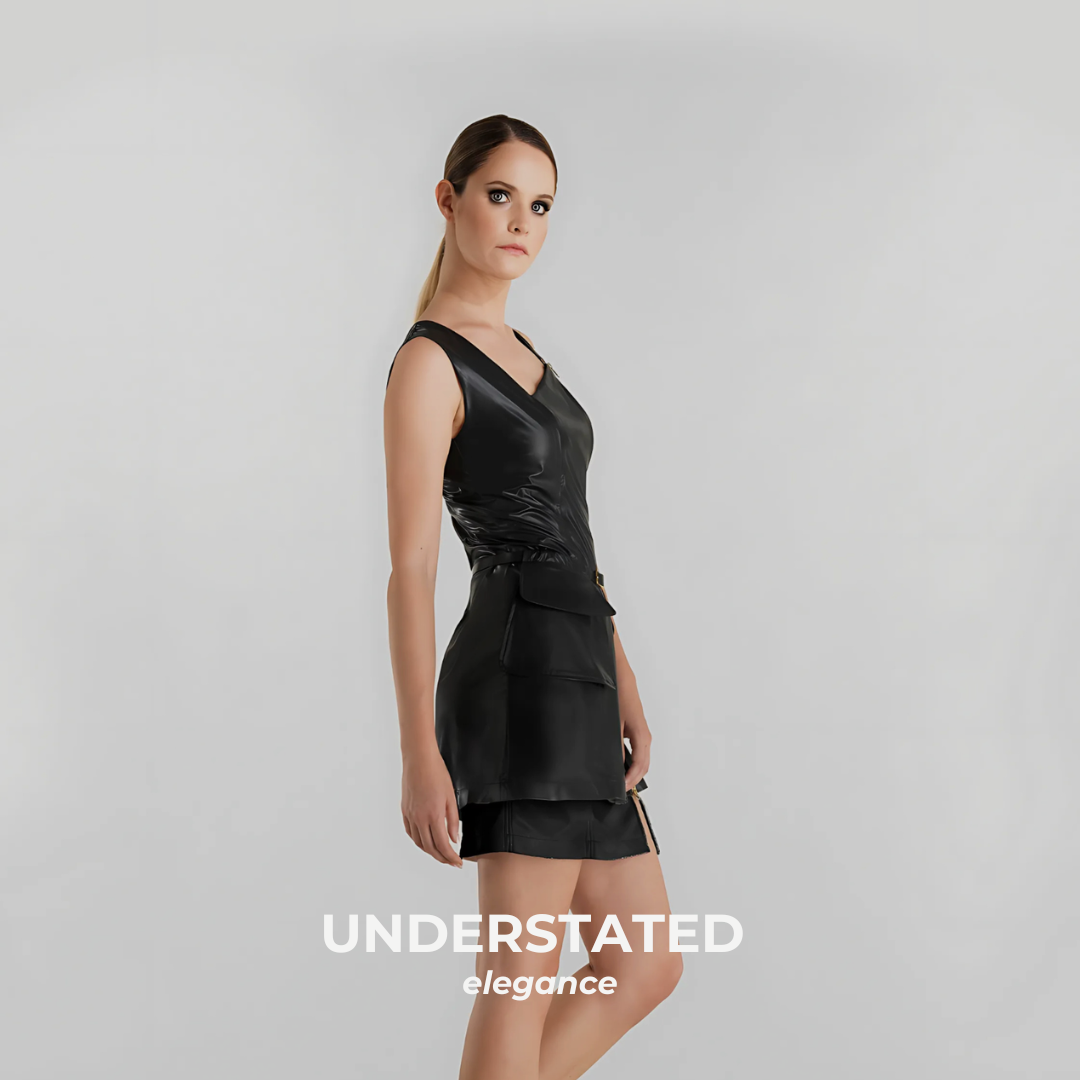
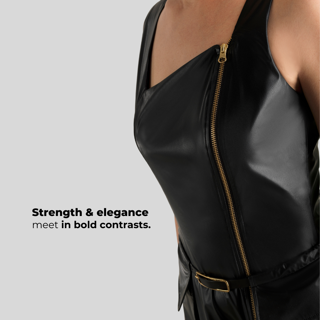
Mimi Flow began with a little black dress able to change rhythm. The long zip followed its line; belt and pocket made it more casual and structured, while without accessories it returned to something classic and essential. “Flow” suggested the continuation of Mimì’s gentleness—fragile, but never passive.
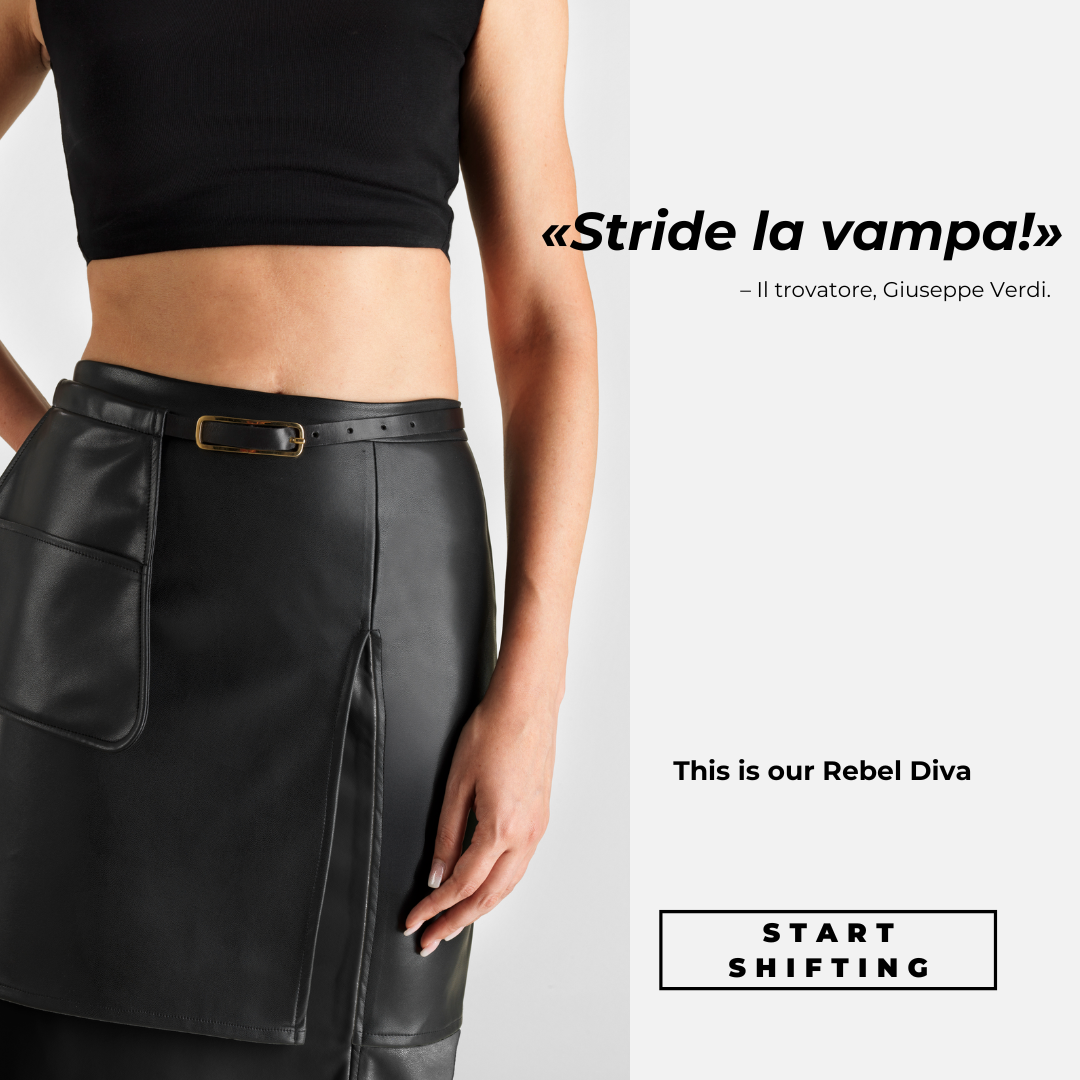
A diva not constructed for the audience’s gaze, but the protagonist for herself. “Rebel” did not mean aggression. It rejected the idea of a diva made only for the stage and the public eye: she is first and foremost her own protagonist. The skirt could change through a belt, pocket, and layers while retaining a strong, autonomous presence.
The overarching “Opera Meets Rock” concept came from the project lead. I independently developed the pairings between opera arias and rock lyrics, as well as the graphics and publishing.
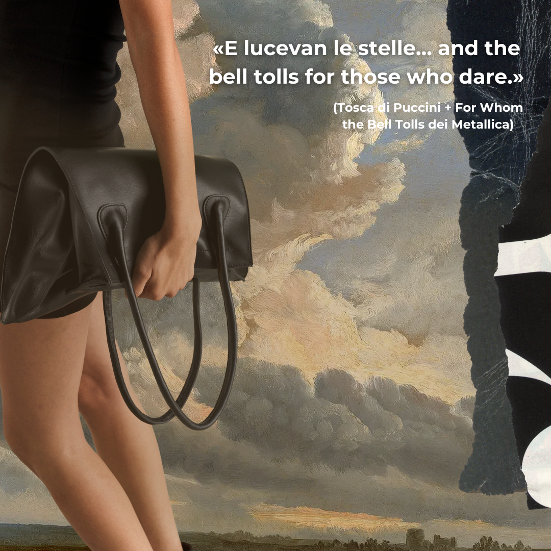
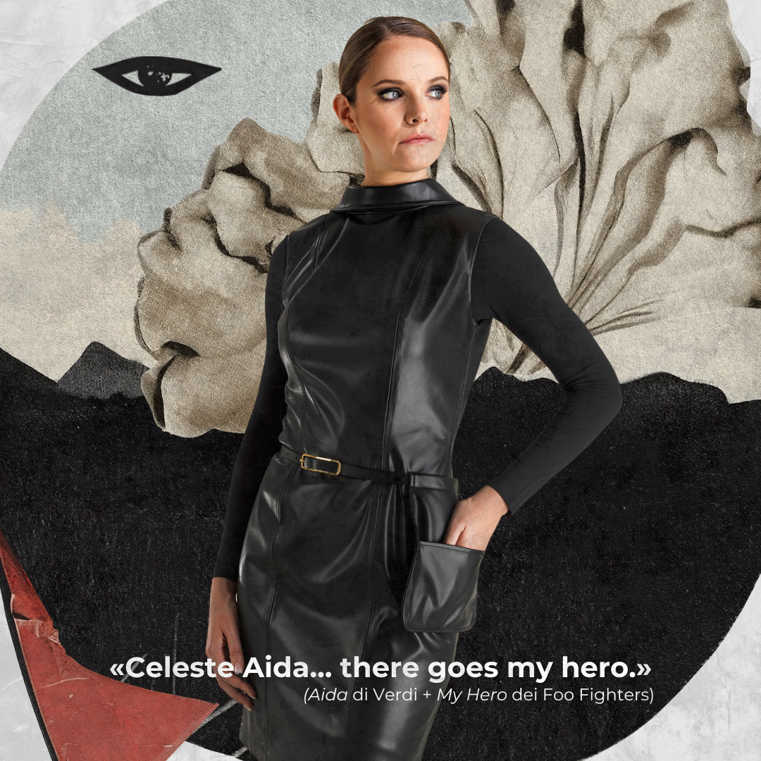
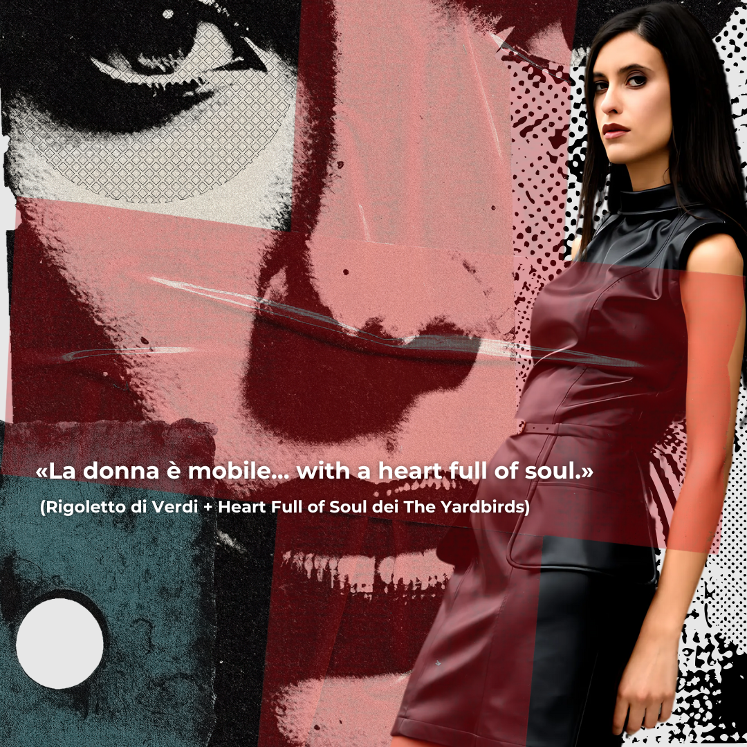
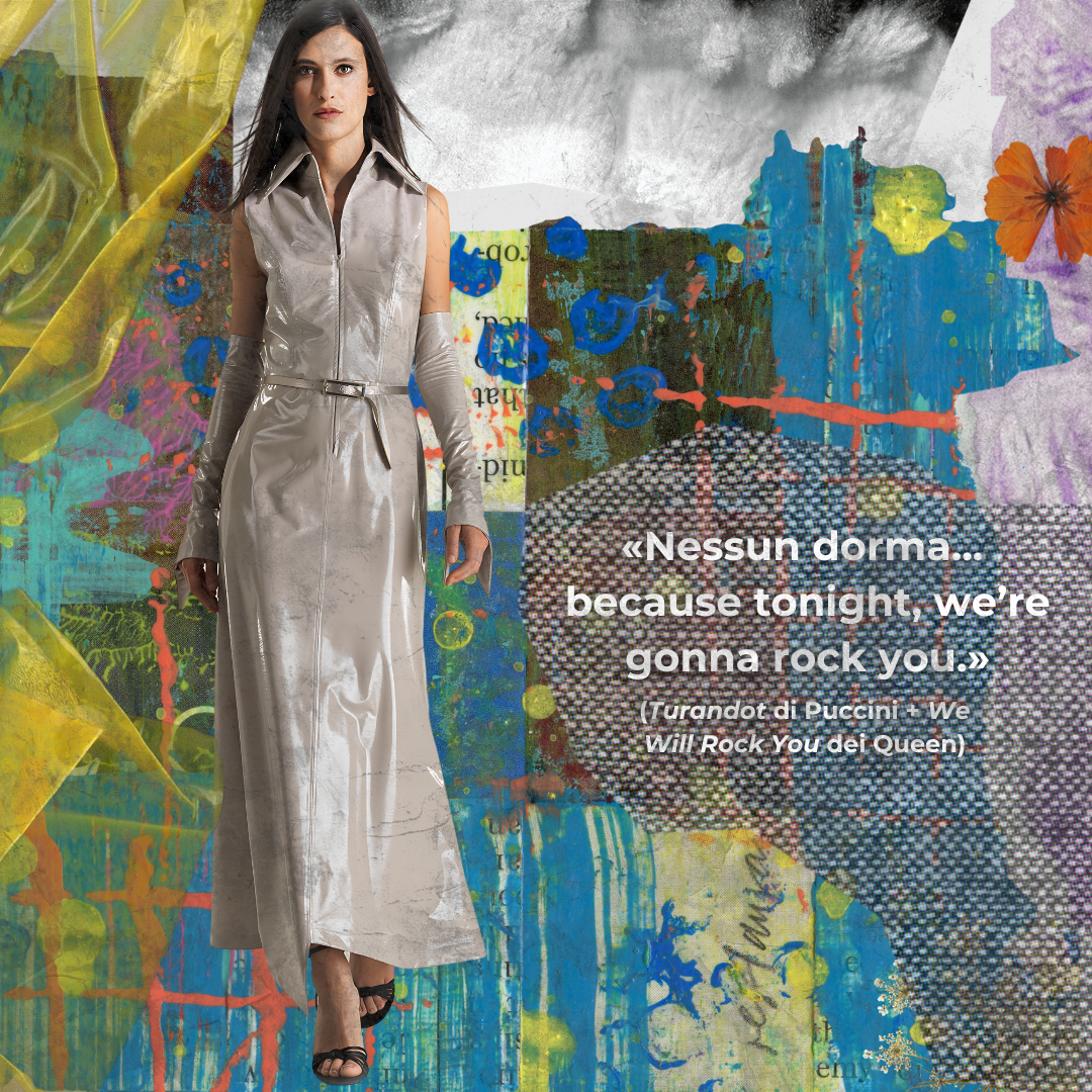
Opera opens the sentence; rock diverts it.
A series exploring universality, power, versatility, mystery, and simplicity. Each strand begins with the same question and develops it through a short sequence.
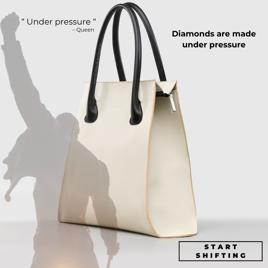
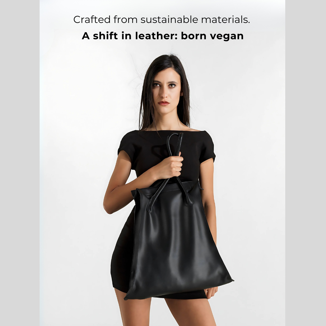
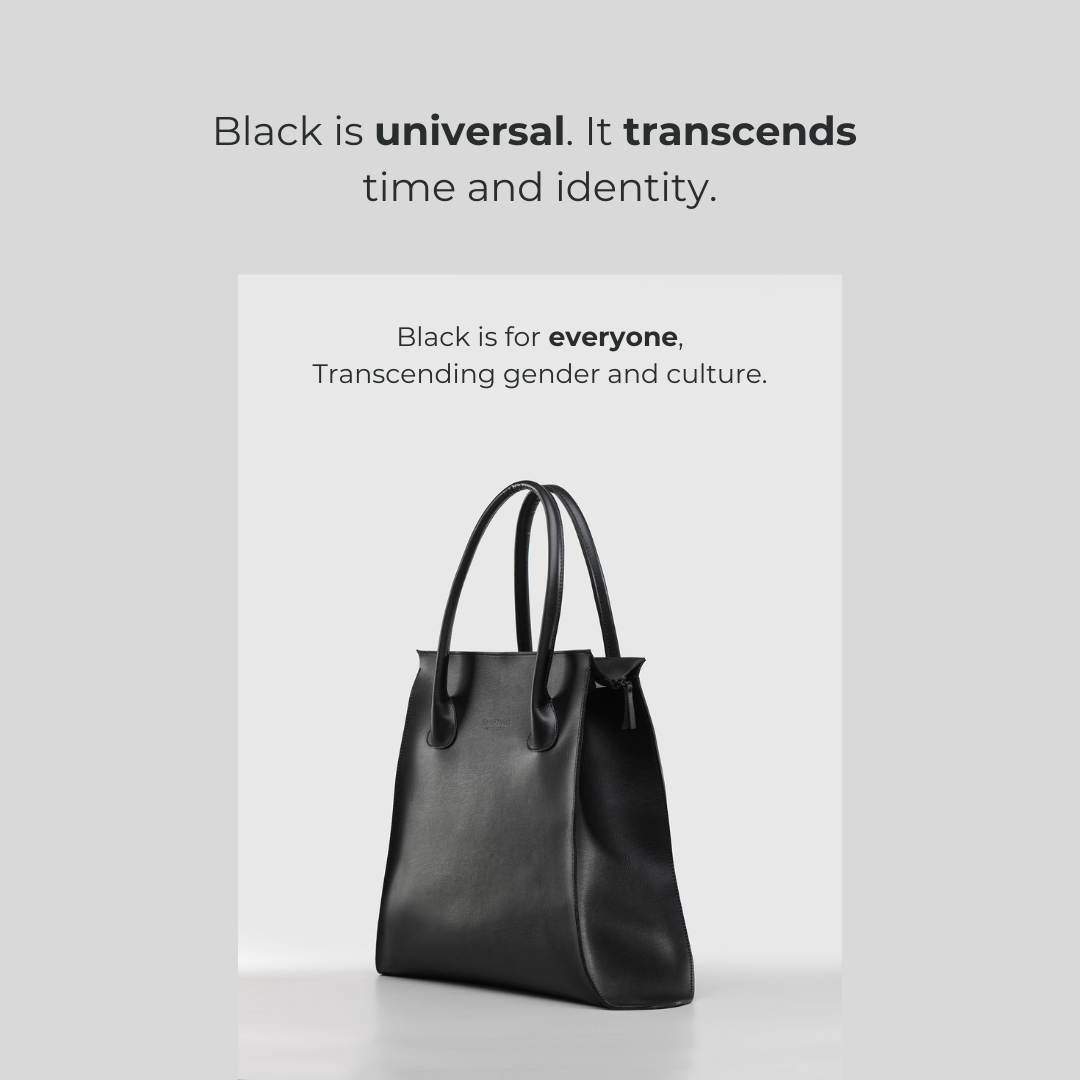



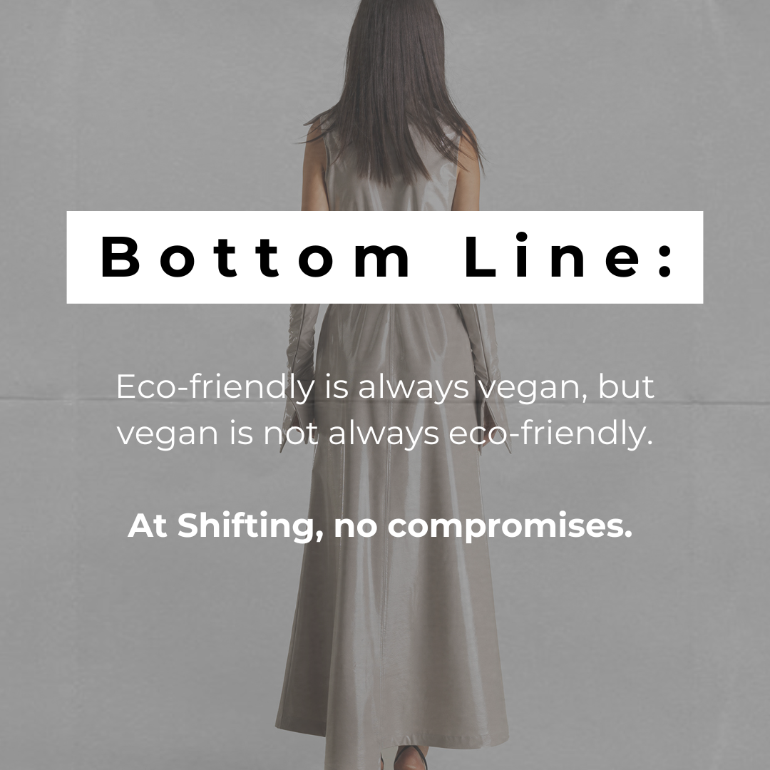
The piece began with a recurring misconception: treating “vegan” and “eco-friendly” as equivalent terms. I built the carousel to distinguish the two criteria and present the brand’s choice to integrate both without compromise.
Schedules were presented to the project lead before publication. Content order, priorities, and any changes were agreed before going live.
The plan also included stories and reels. The video starts manually; it does not autoplay or introduce additional animation on the page.
The project lead analysed content performance. My work covered themes, content, graphics, planning, and publishing.