Metodo
How SP works.
Ongoing collaboration.
At SP-Formazione, I work on both institutional communication and the design of learning materials. My role combines strategic writing, content design, and the development of educational tools for courses, events, and professional learning journeys.
I shape the tone of voice, define editorial formats, and write copy for LinkedIn, Instagram, and Facebook. I develop content, support management in drafting official materials, and design the narrative structure of videos and campaigns.
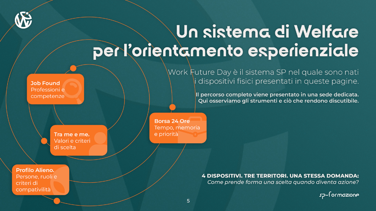
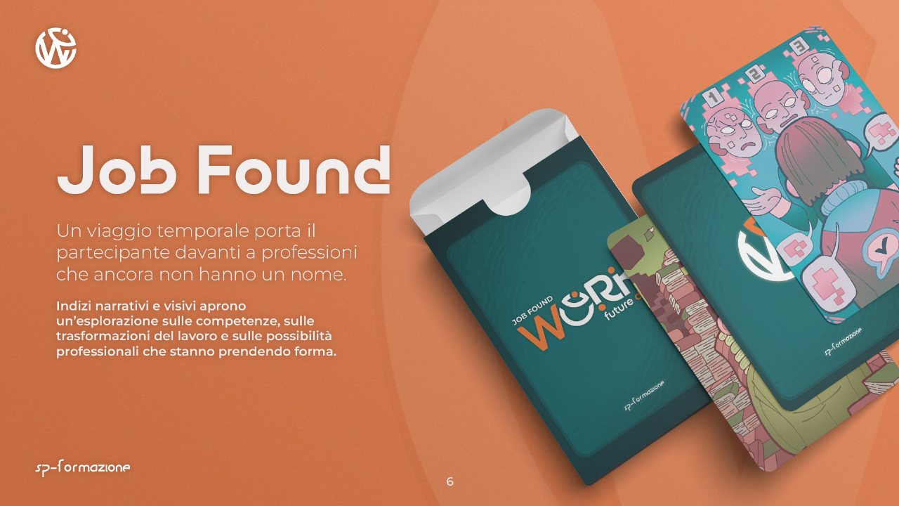
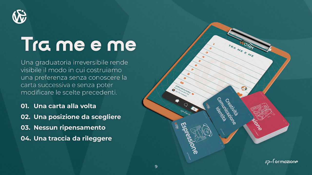
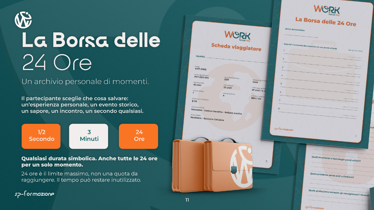
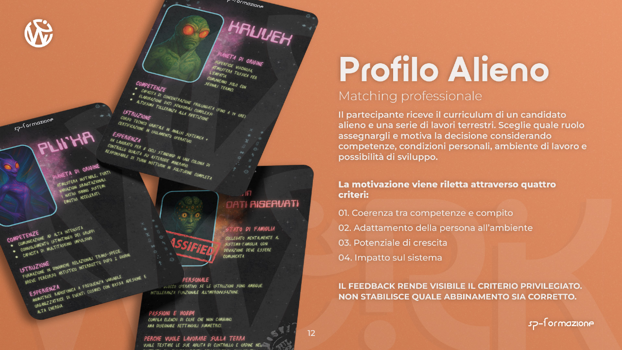
The brief was to create career-guidance tools for different age groups, time frames, and contexts. From there, I designed each individual experience: I devise the story, define the participant’s role, and build the objects and journey through which decisions are made.
Some mechanics are original; others draw on existing models that I rework and adapt to the specific objective. This work produced Job Found, Between Me and Myself, The 24-Hour Bag, and Alien Profile. Job Found then continues into the Career Map, designed to revisit and discuss what emerged during play.
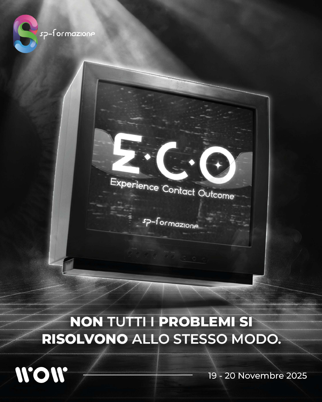
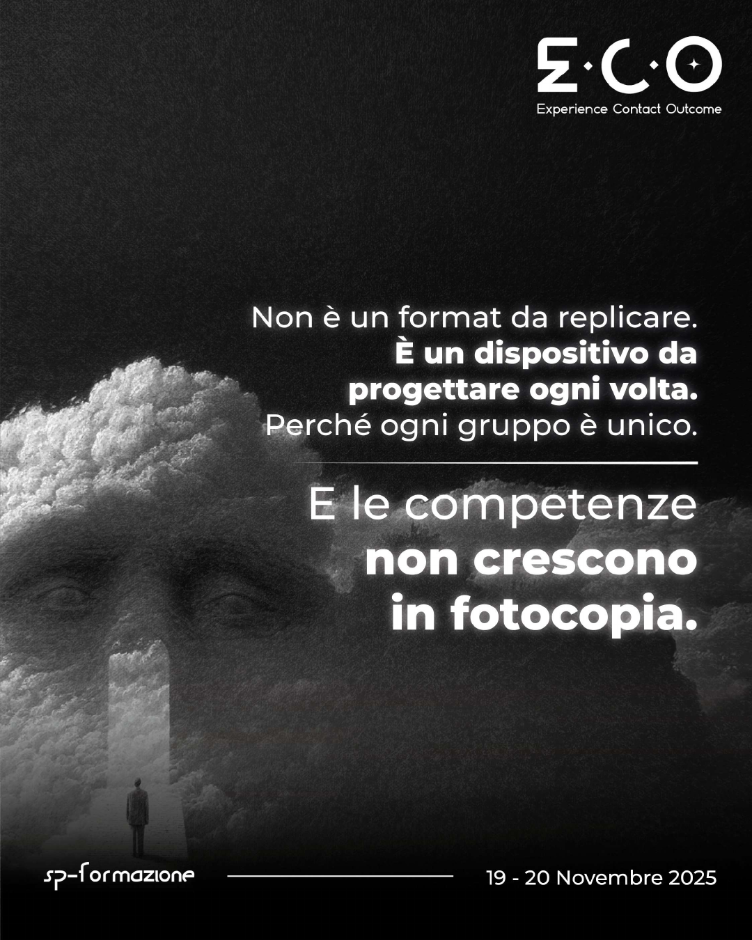
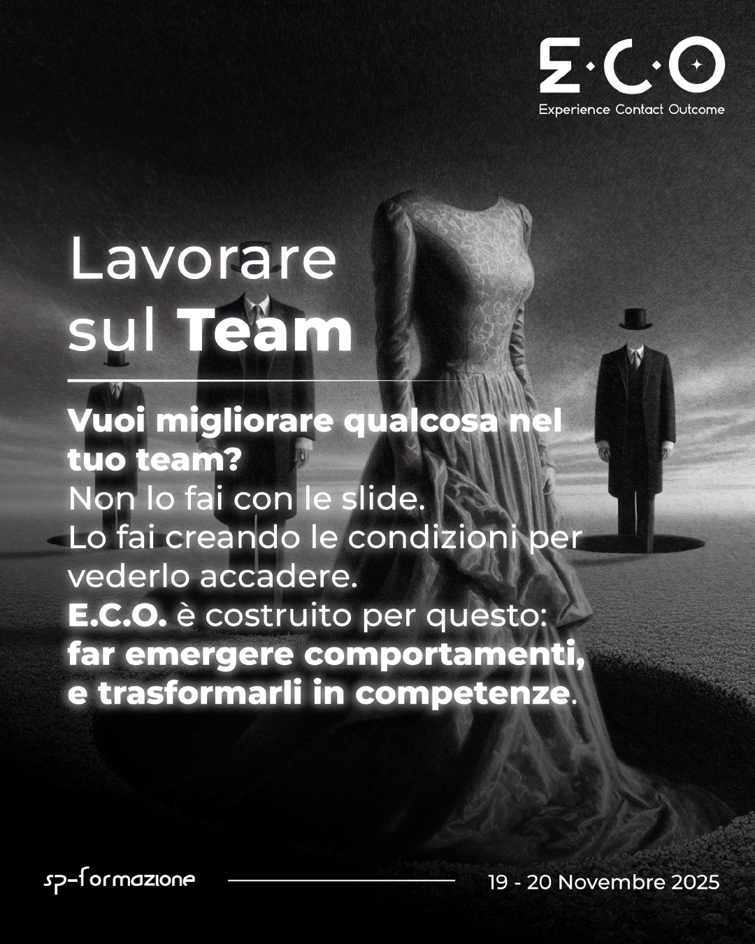
The experience, its basic rules, and the use of puzzles already existed. I formalised the method, adapted each session to its group and context, and developed new puzzles and games for different editions.
I also created Sybil and DON using the E.C.O. methodology, defining their story, voice, function, and relationship with participants.
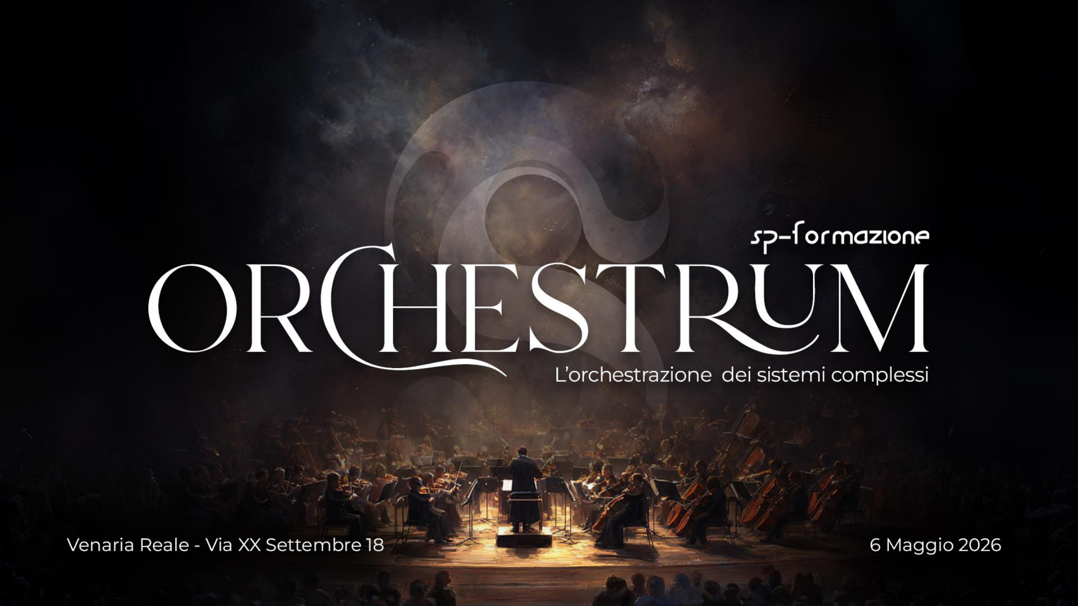
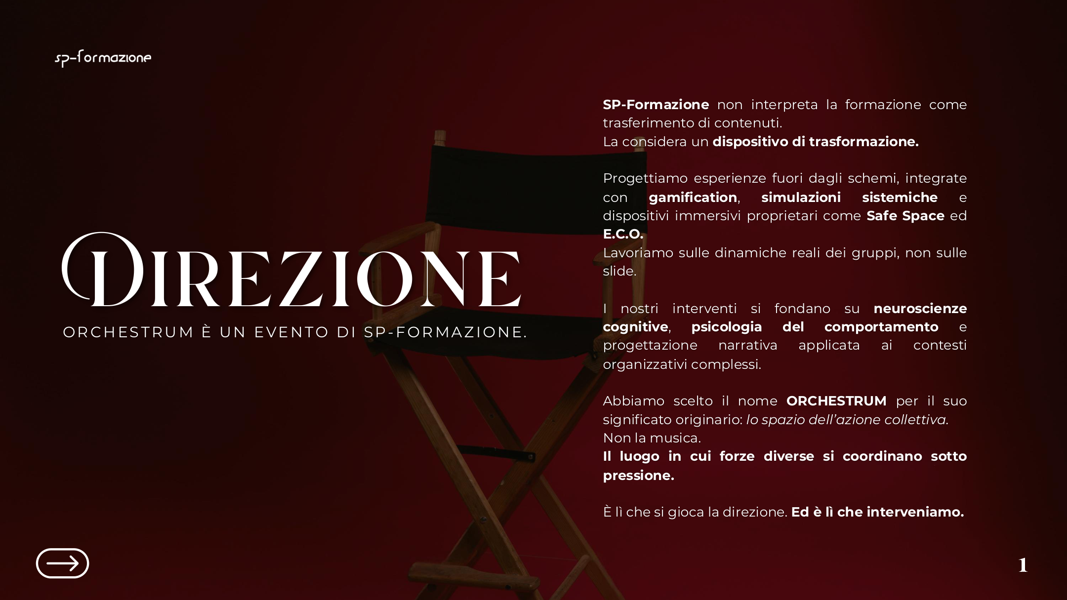
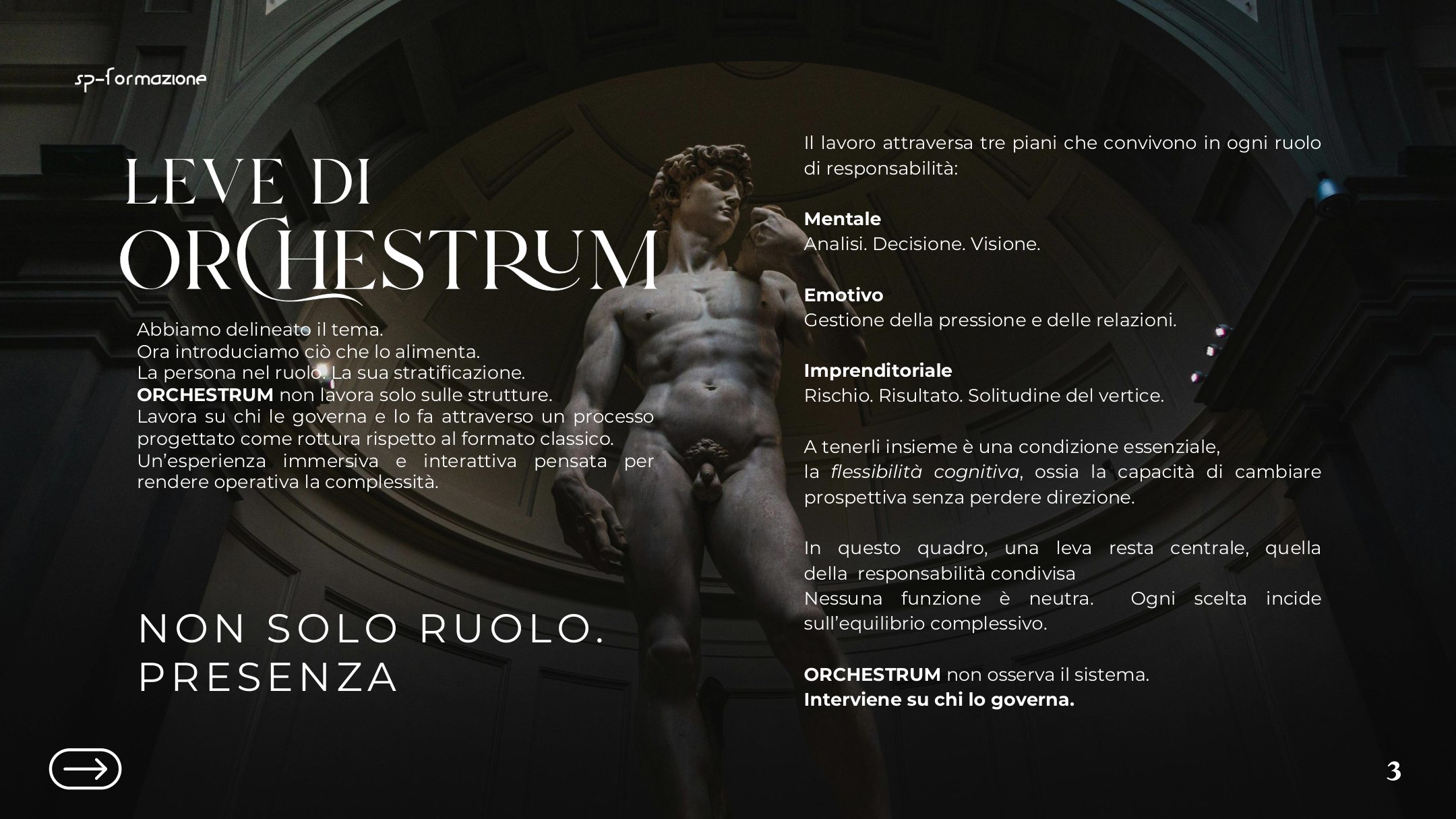
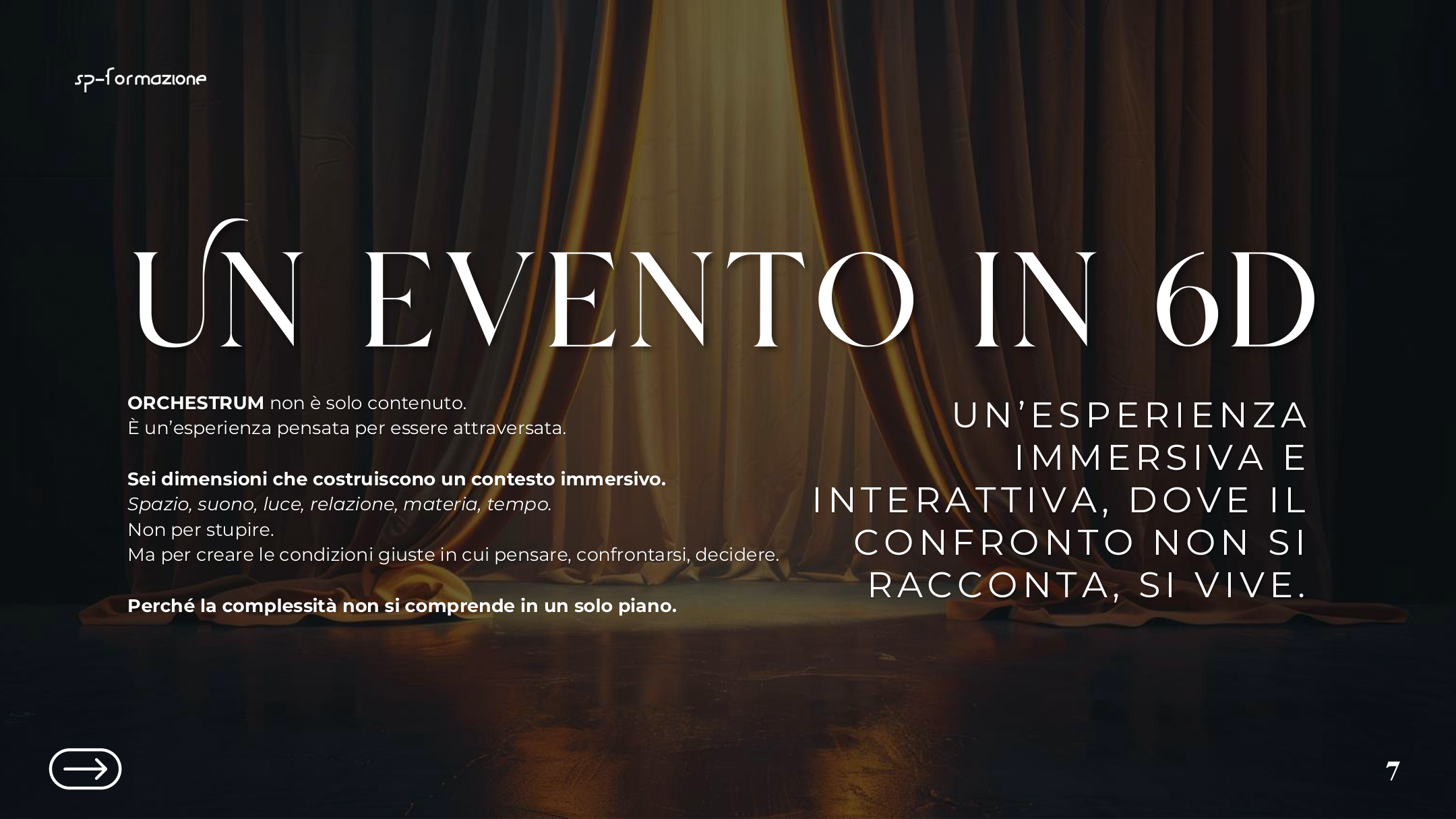
For Orchestrum, I returned to the narrative line used in E.C.O. but adapted it to an event without puzzles. DON became a dedicated voice, responsible for introducing and guiding the entire experience.
I wrote the narration, booklet, and in-depth articles connected to the speakers. I also worked on the project’s digital translation and dedicated website.
I designed the three pinned posts as a navigation system for the profile. The first presented SP’s method, the second clarified what SP was, and the third showed who it addressed through the themes of study and the experience of learning. The three pieces served different functions but shared a recognisable voice, together forming an initial reading of the project.
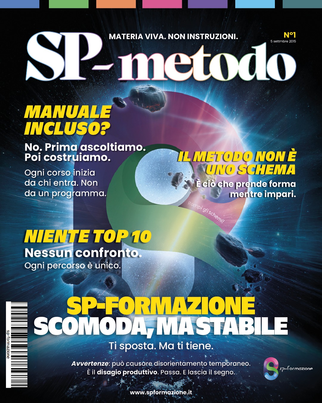
How SP works.
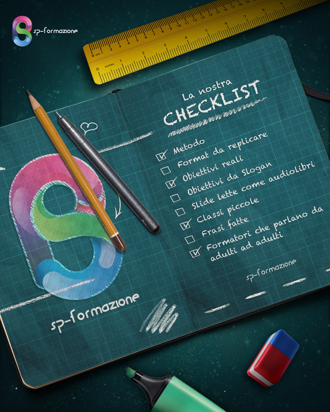
What SP is.
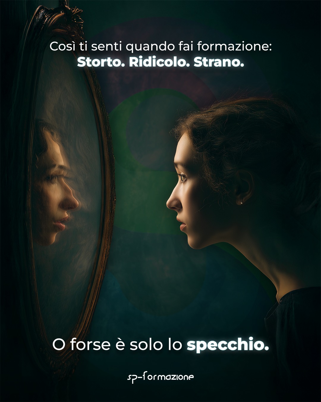
Who SP is for.
Three pieces born from different objectives: position a corporate course, overturn the idea of study as suffering, and build an ironic seasonal greeting from a visual constraint.
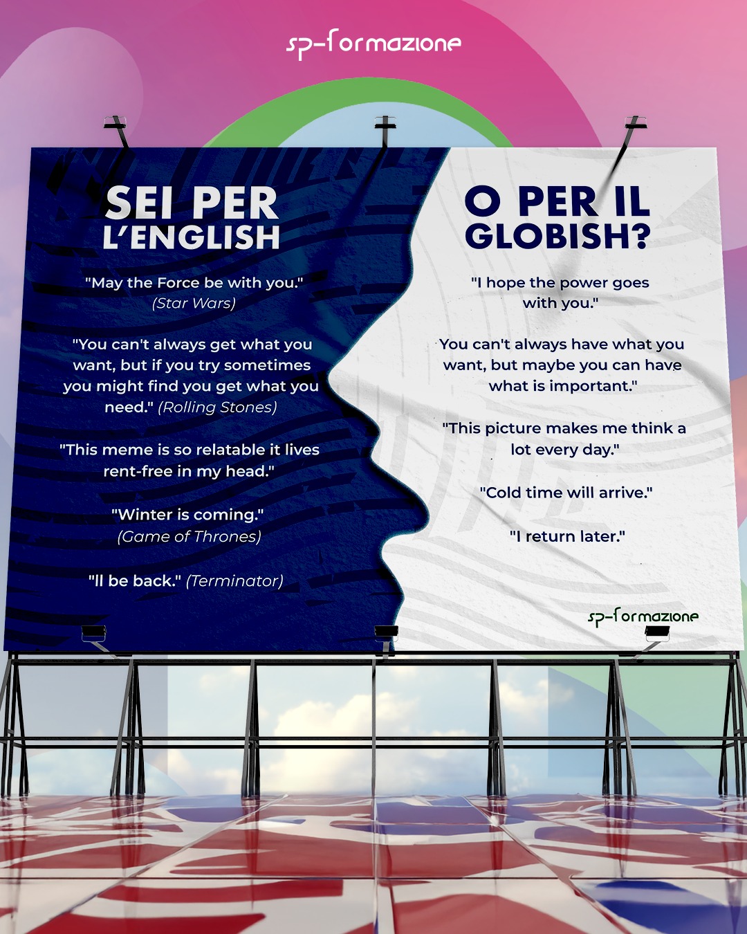
To promote English courses for companies, I did not want to create a conventional poster. I began with the difference between Globish and English: not merely making oneself understood, but truly conveying a message, grasping its nuances, and being able to sell an idea. The post thus turned course promotion into informative content and clarified SP’s positioning: not English that is “good enough” to communicate, but a professional tool.
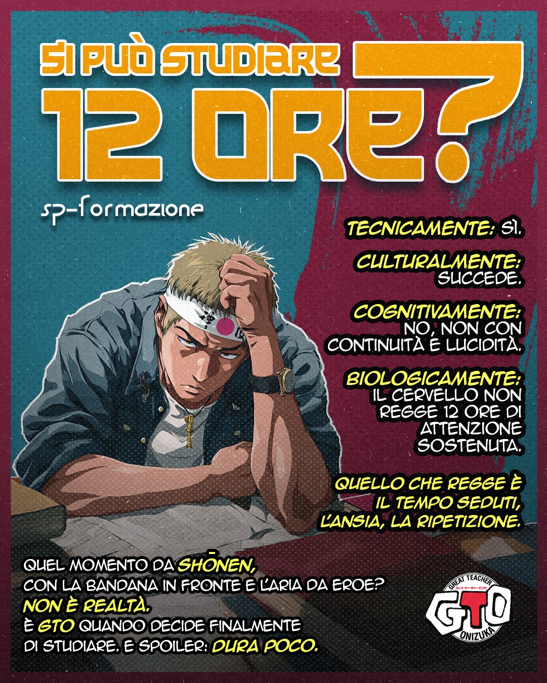
To discuss studying, I chose a scene from GTO in which Onizuka studies with nails fixed above his head so that pain wakes him whenever he falls asleep. The image takes a still-common idea to its extreme: that learning must necessarily hurt. The content was created to overturn that representation. Studying requires effort, but it should not become an endurance test or a form of suffering.

For the Christmas post, I wanted to avoid the usual greetings and show SP’s more ironic side. The first idea revolved around a school for Father Christmases, but I could not find suitable photographs, while the graphic designer had found an image of a seated Father Christmas that worked well. I therefore revised the concept to support the visual work, redirecting it towards the story of Gemini 6A. The constraint produced a different solution, perhaps an even more effective one.
One standalone piece, three carousels, and Nervo Scoperto.
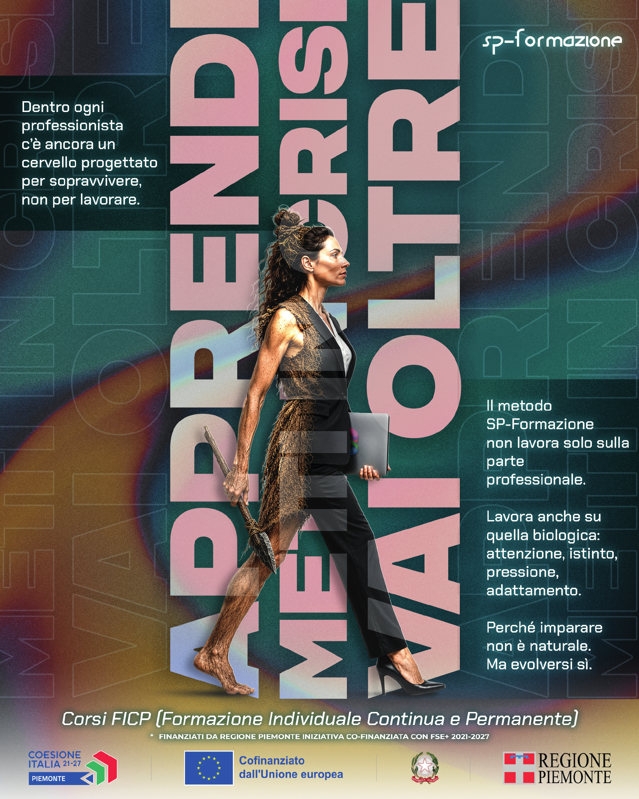
To present the FICP courses, I did not want to begin with a conventional poster or a simple list of learning opportunities. I wanted to address a deeper question: what changes in study and learning when training enters the workplace?
I therefore began again from the brain and SP’s strengths—cognitive science, neuroscience, and attention to the individual—to show that continuing education is not only about professional skills, but also the cognitive conditions that make genuine learning possible. I added SP’s method through the reference to Shu-Ha-Ri: learn, challenge, move beyond. A way of showing that this is not simply lecture-based training.
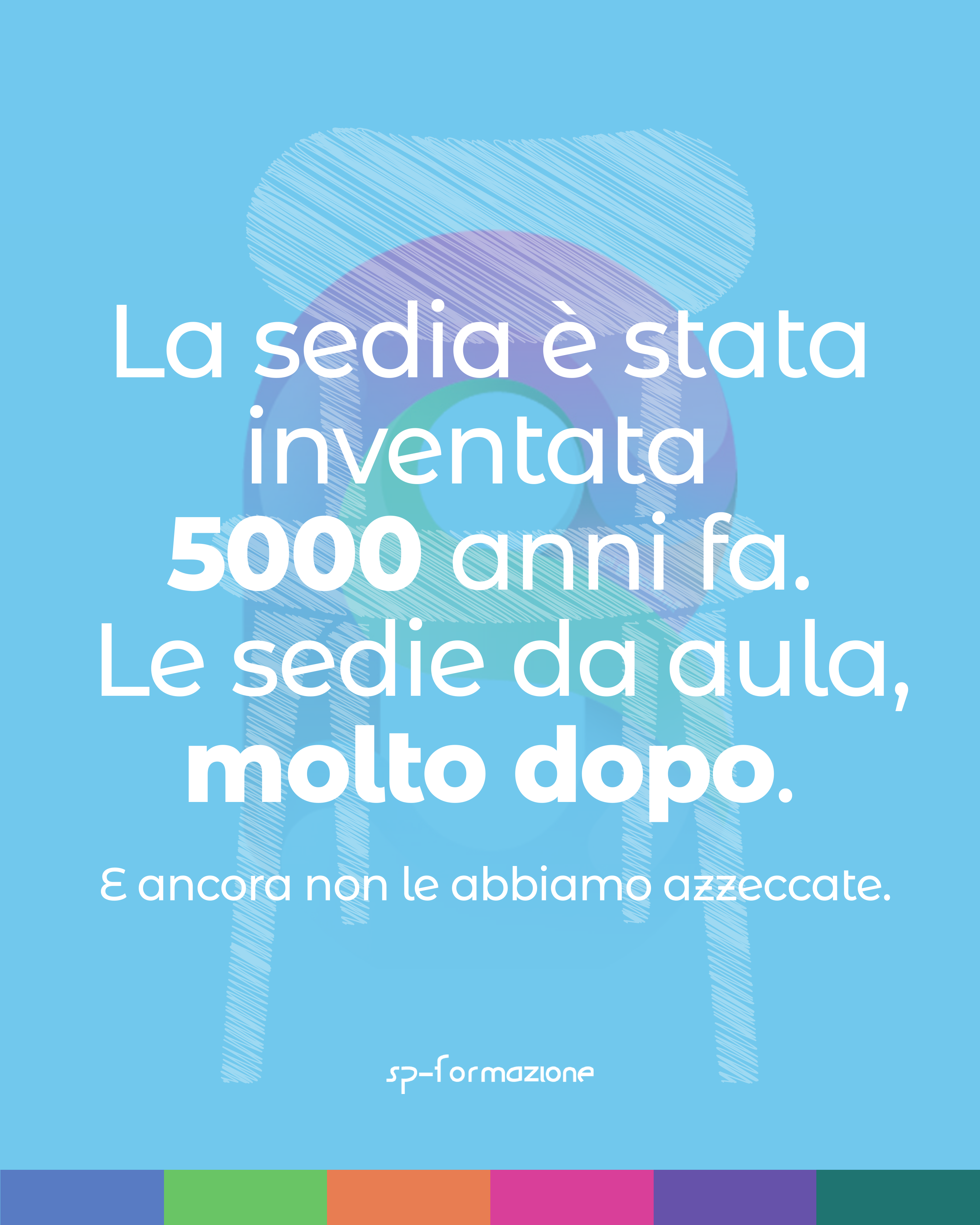
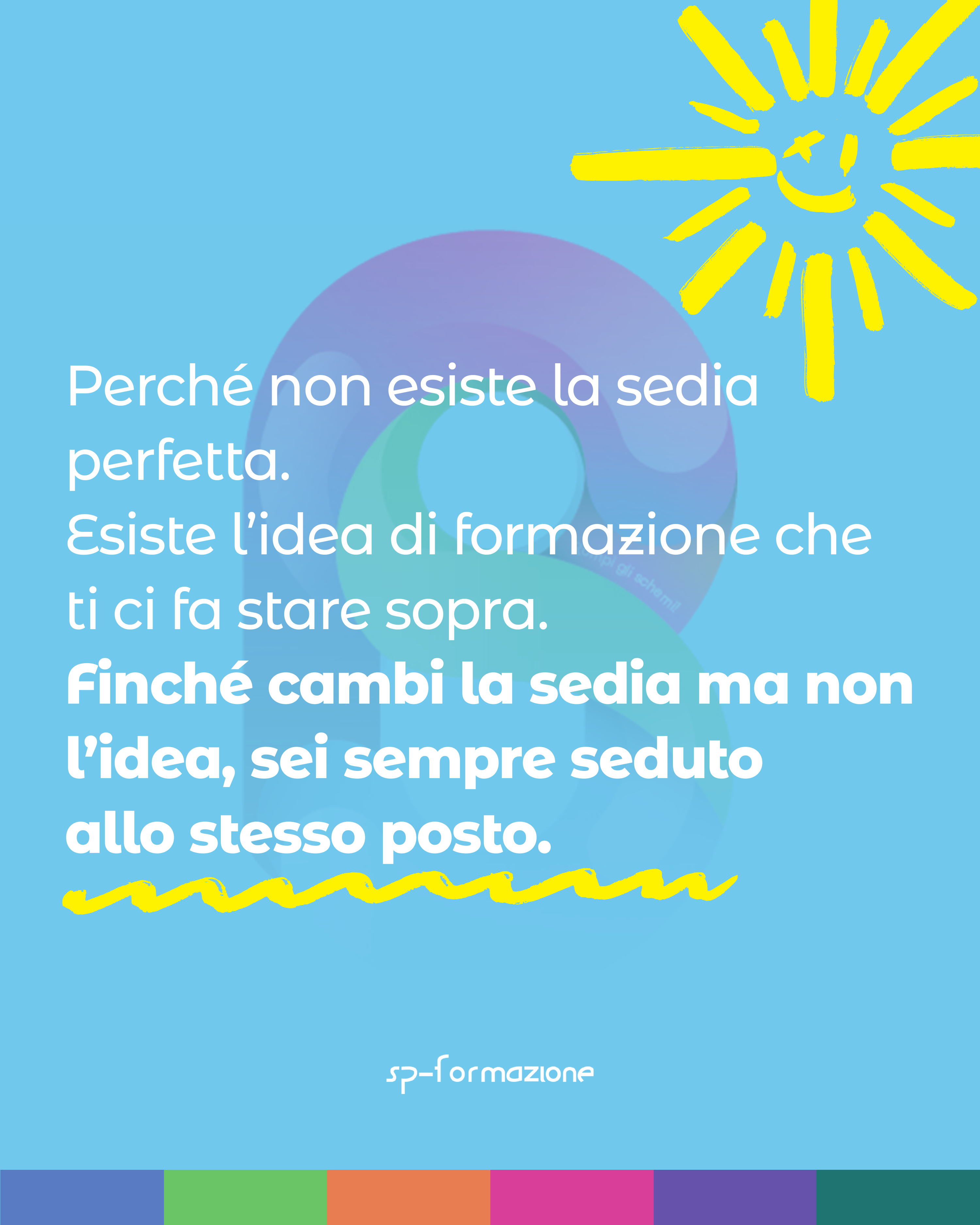
The idea began with a concrete memory: at Holden, the chairs were terribly uncomfortable. I wondered why classrooms continued to be organised around desks and chairs, and why that particular kind of chair. I investigated whether it was a remnant of the past or the result of a precise logic; the carousel grew from that research.
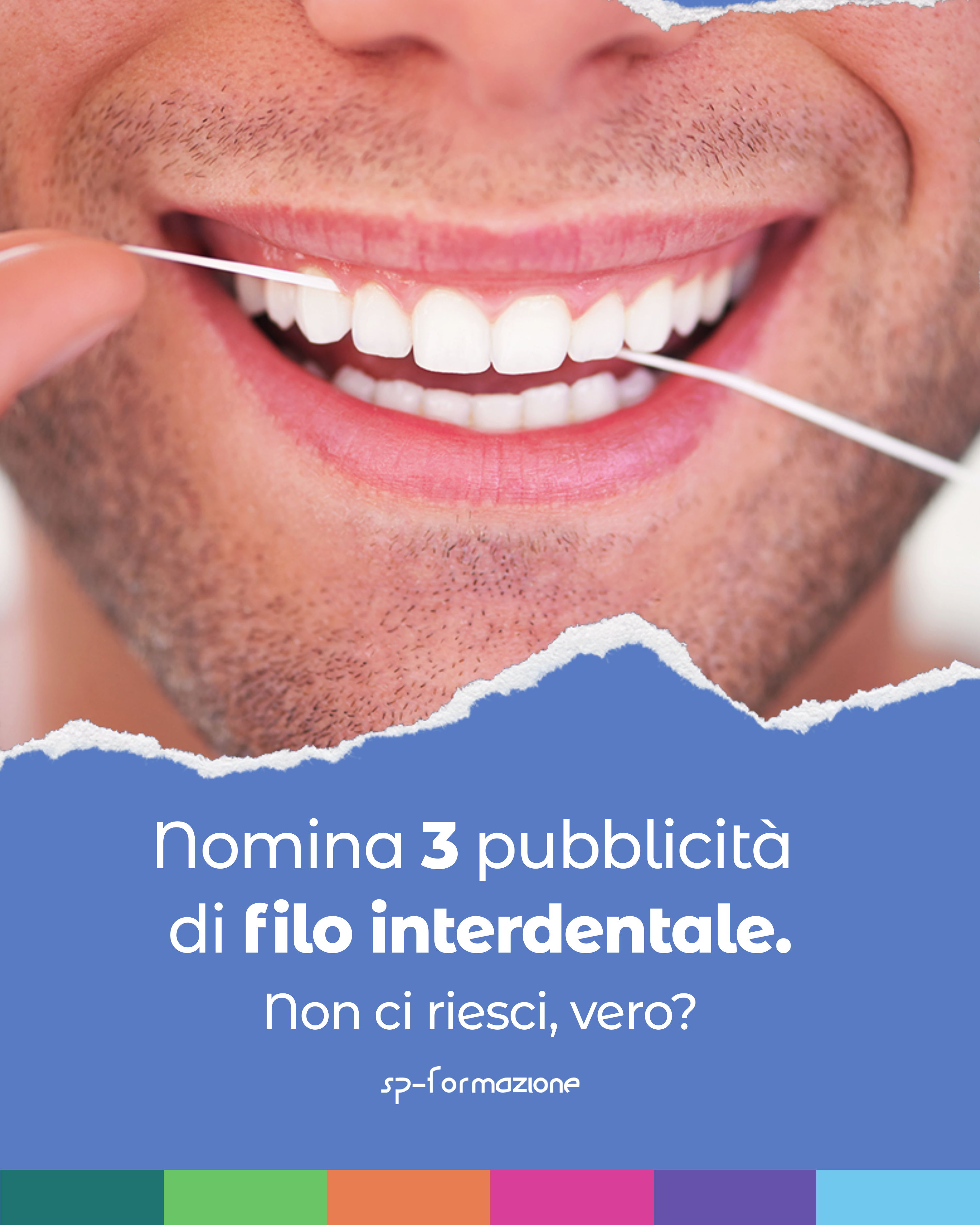
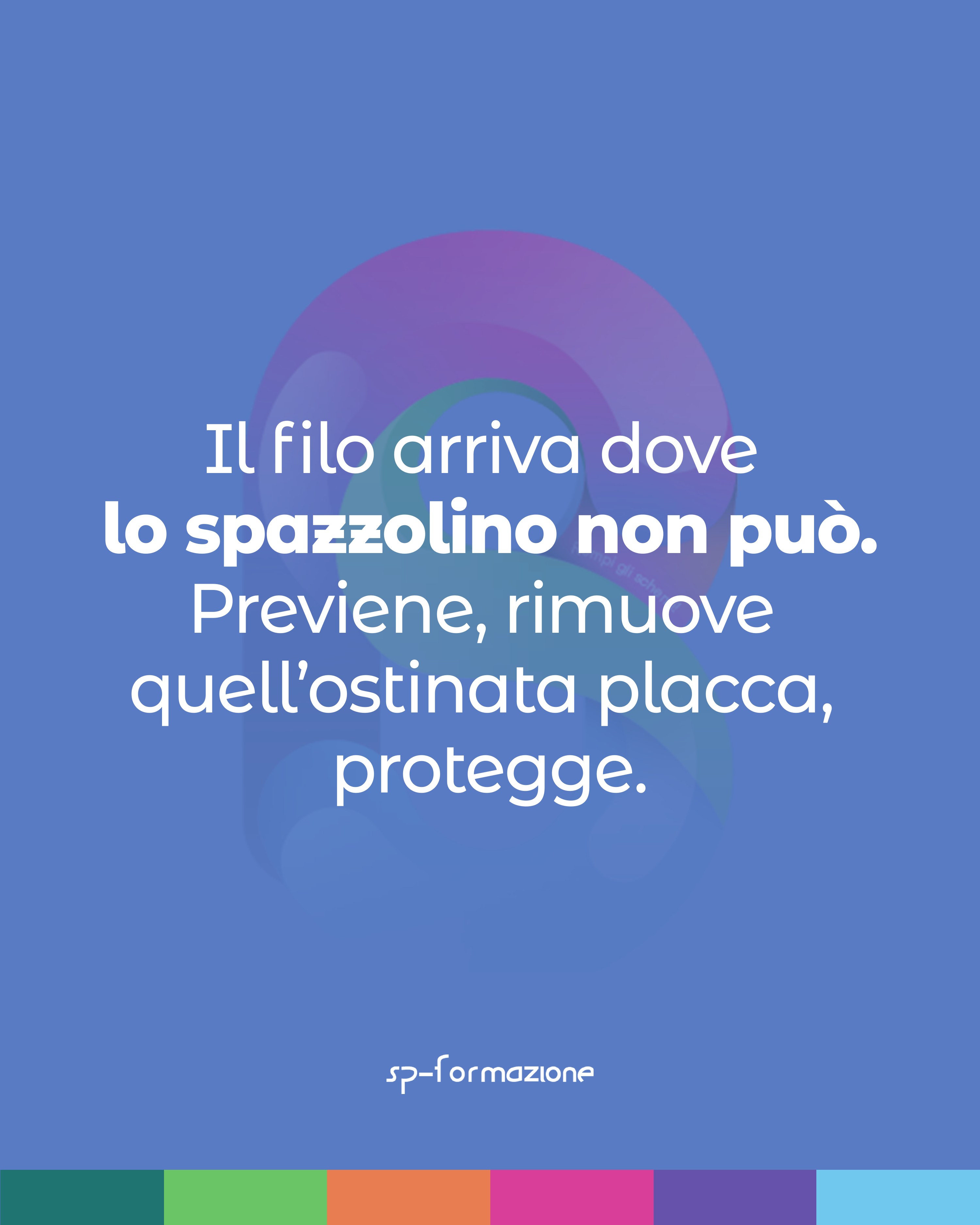
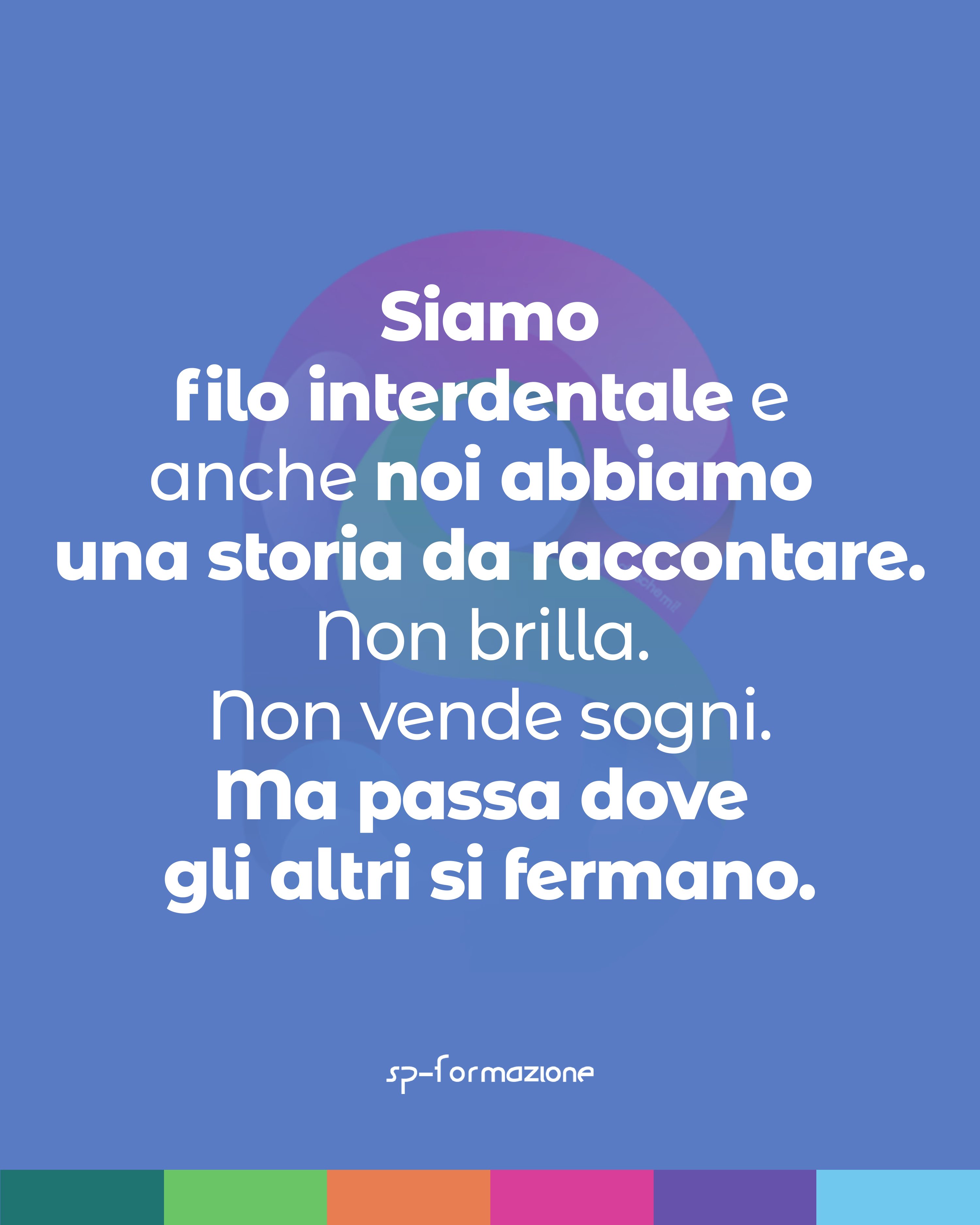
The idea began with a simple observation: I flossed regularly and my dentist could see the results, yet we remember many toothpaste adverts and almost none for dental floss.
I used this friction to talk about SP: not everything that works is spectacular; often, what acts most deeply is also what gets talked about least.
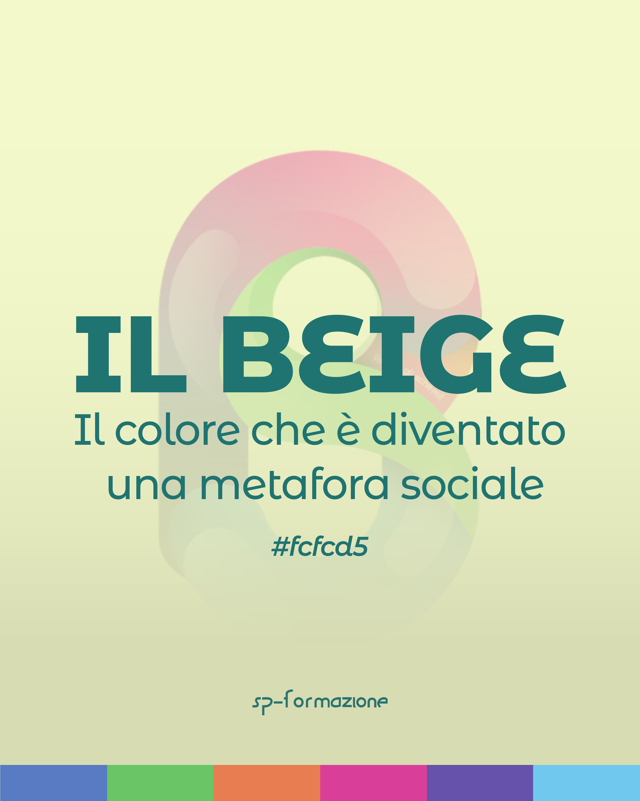
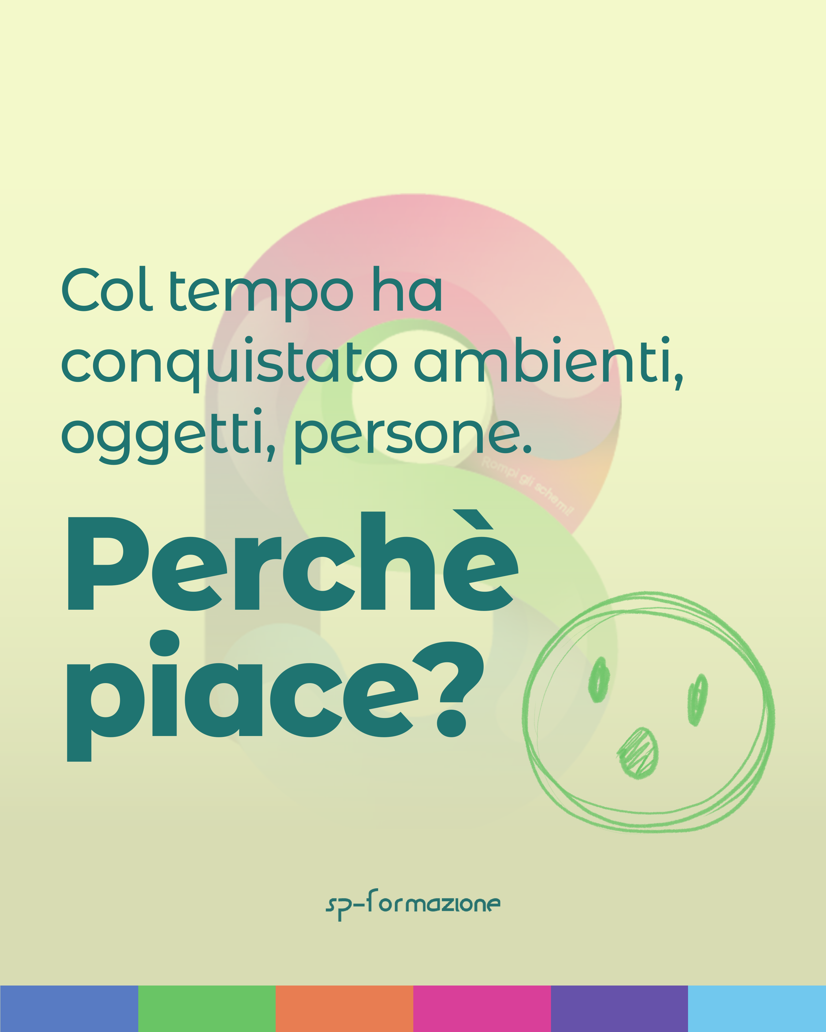
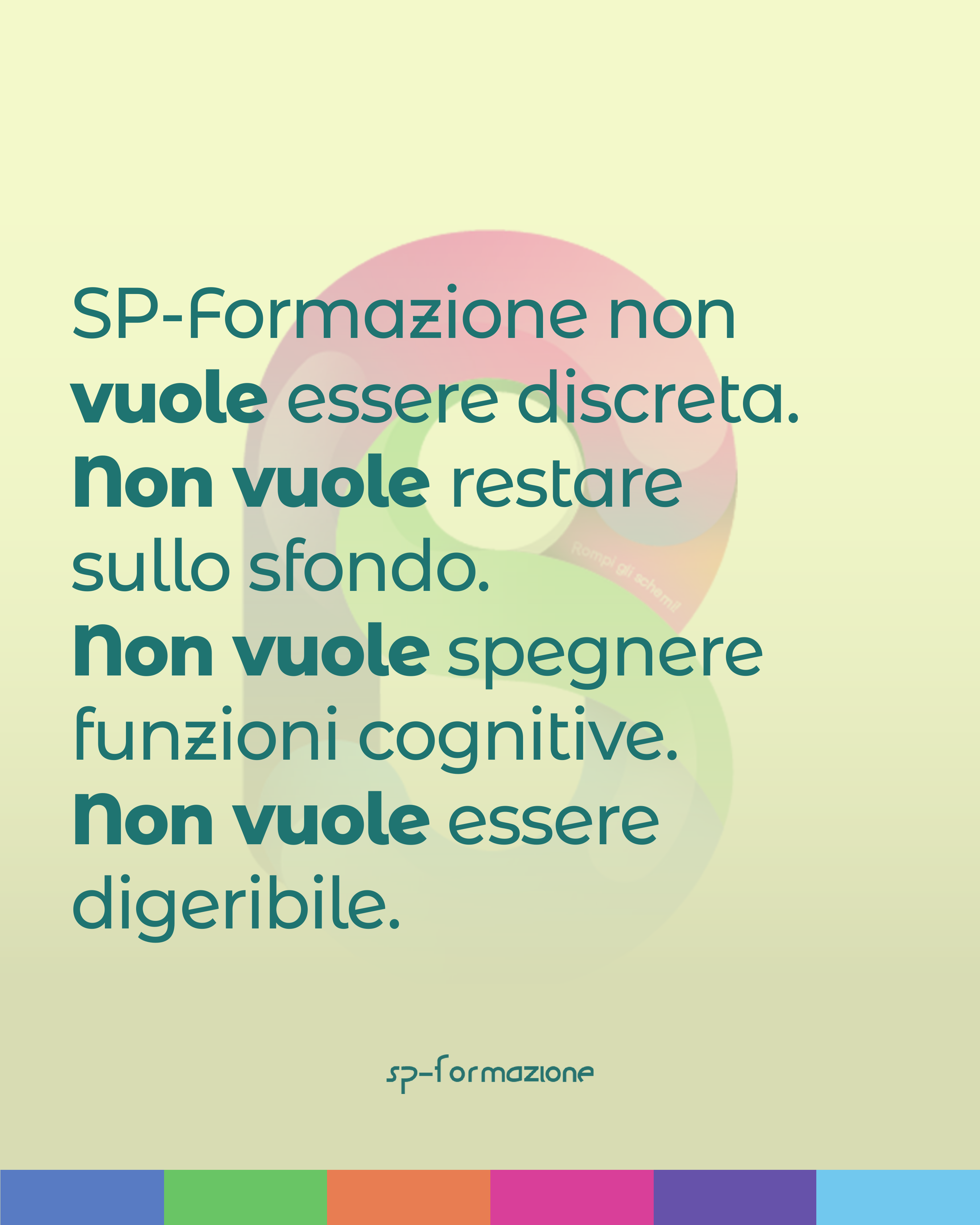
The idea began with the phrase “beige person,” used to describe someone who takes no position and is fine with everything. I began studying the colour, looking for objects, uses, and historical episodes that could explain how it became a metaphor for neutrality and safety.
From that research, I built the connection to SP: an organisation that did not want calm, reassuring communication suitable for everyone. It wanted to take a position, trigger a reaction, and refuse to remain in the background.
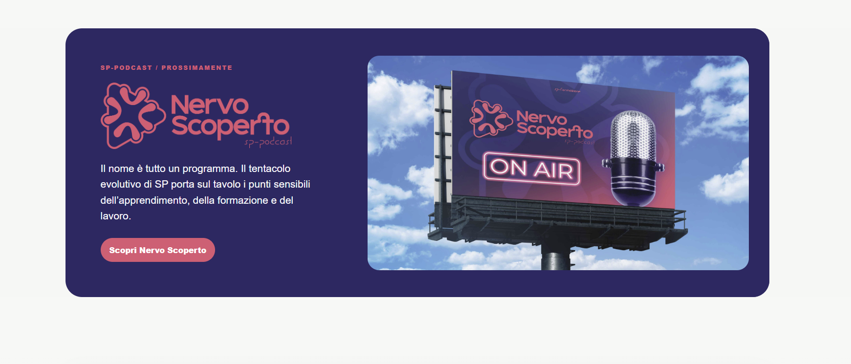
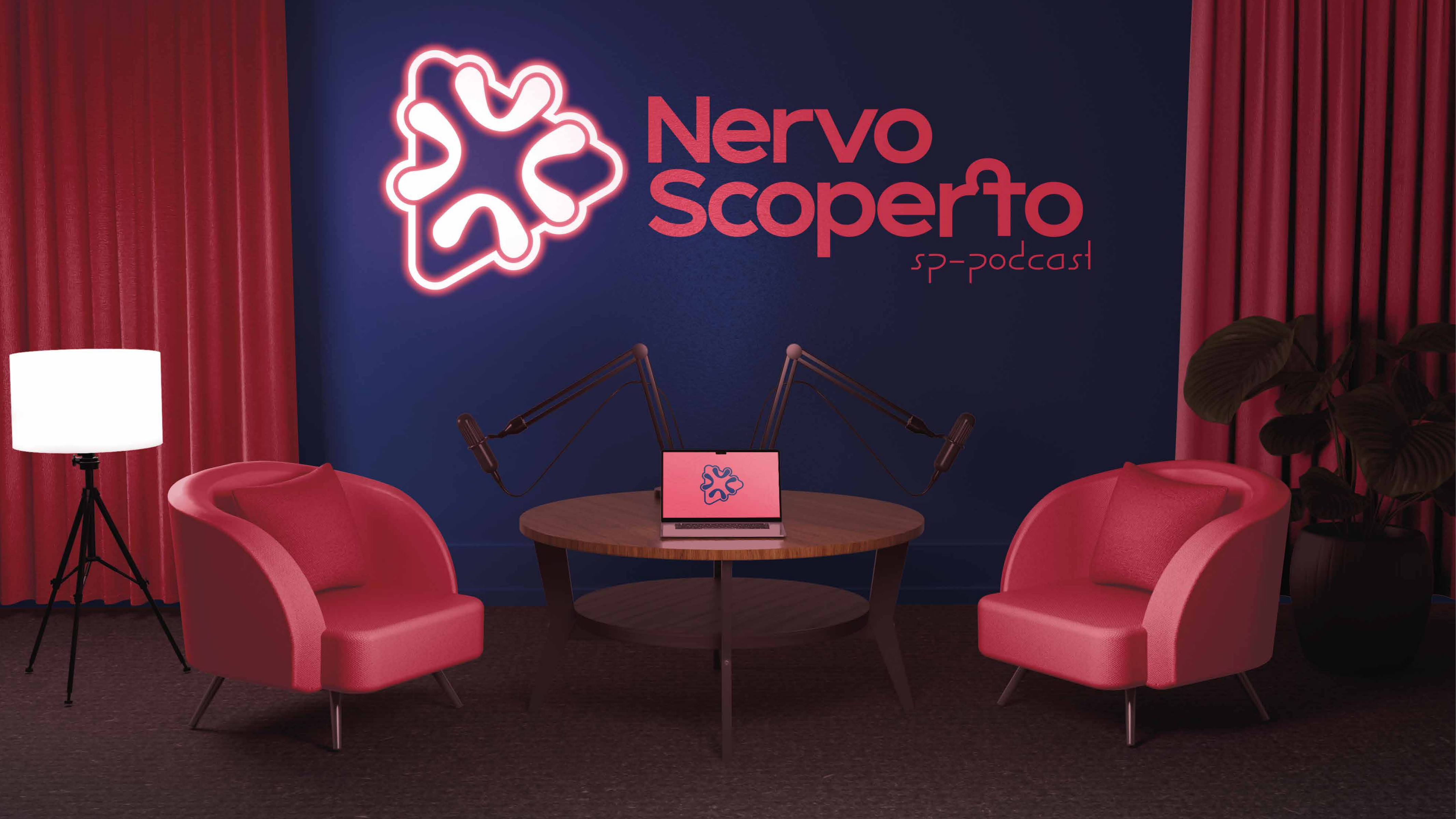
I created the name and manifesto for Nervo Scoperto, SP’s podcast devoted to the sensitive points of learning, education, and work.
I also worked on the episodes, defining themes, questions, and the development of each conversation.
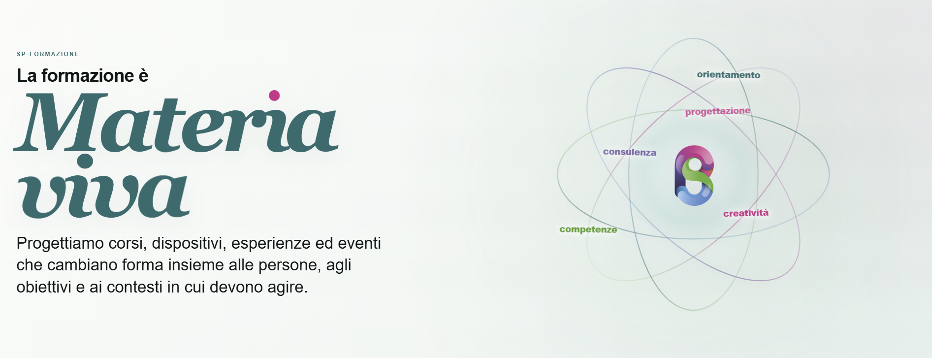
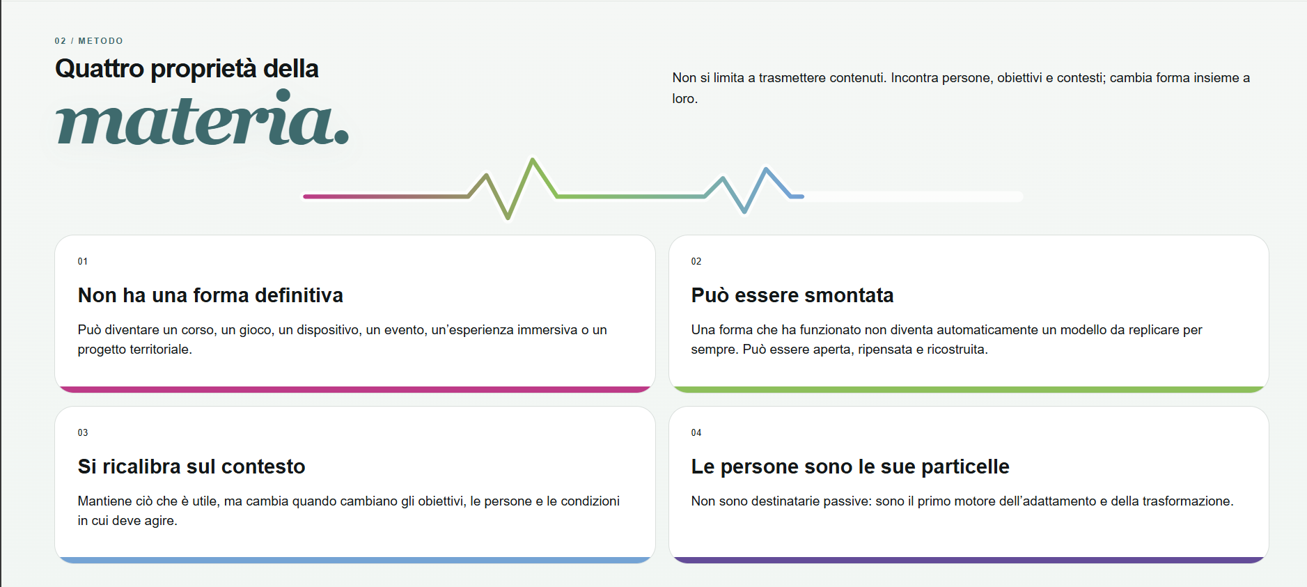
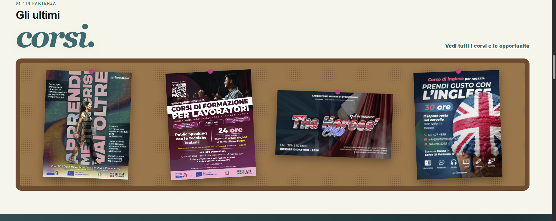
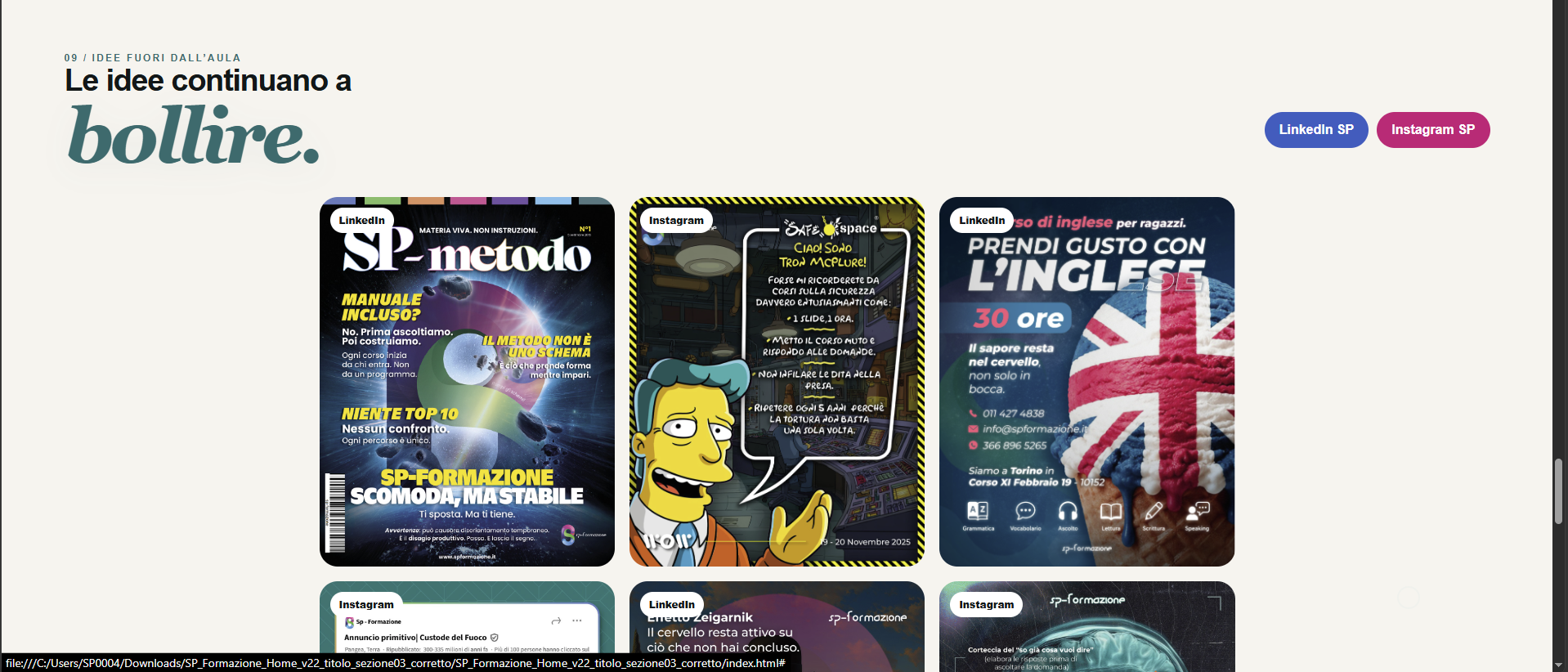
For the redesign of SP’s home page, I began with the concept of Living Matter. I represented SP as a nucleus around which professionals, skills, tools, and opportunities move. From this reading, I built the page architecture, content hierarchy, visual system, and animation logic.
The proposal was not implemented, but the prototype shows the transition from an identity concept to a complete, navigable digital structure.